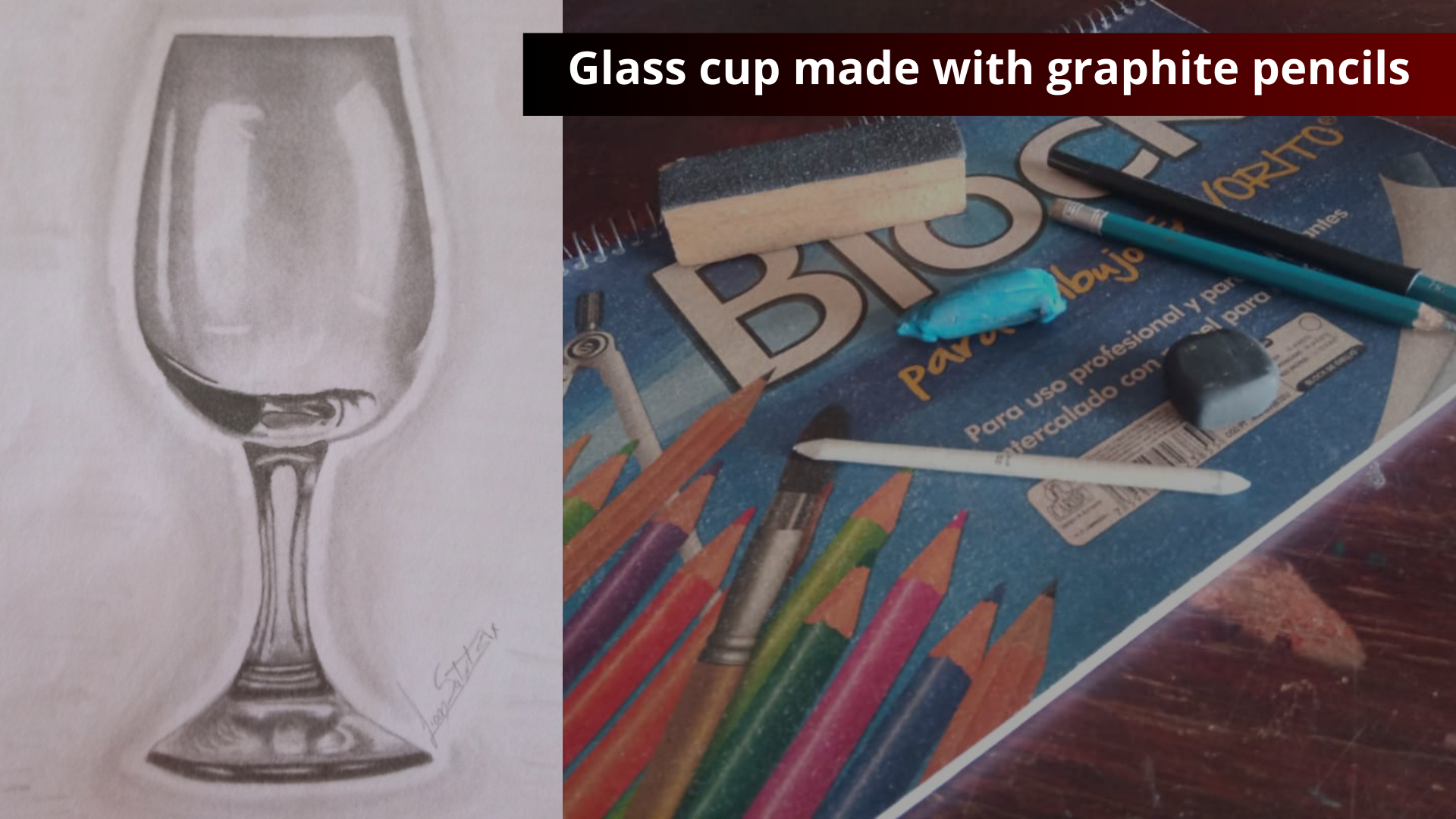
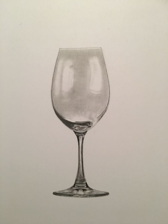
Saludos mis queridos amigos, amantes del arte y artistas, sean todos bienvenidos a mi publicación, esta vez, se trata de un dibujo que hice con lápices de grafito, esto lo hice como práctica para seguir mi entrenamiento con el manejo de los dibujos a escala de grises. Ya que es un arte que me gusta mucho en tradicional.
Hay un tipo de dibujo muy útil que podemos hacer para poner en práctica lo que los dibujantes llamamos Valorizar, darle valor a un dibujo sin vida. En este caso, el dibujo que podemos hacer para practicar es una copa de vidrio.
! [English version]
Greetings my dear friends, art lovers and artists, welcome to my publication, this time, it is a drawing I made with graphite pencils, I did this as a practice to continue my training with the handling of grayscale drawings. Since it is an art that I like very much in traditional.
There is a very useful type of drawing that we can do to put into practice what we draftsmen call Value, to give value to a drawing without life. In this case, the drawing we can do to practice is a glass cup.

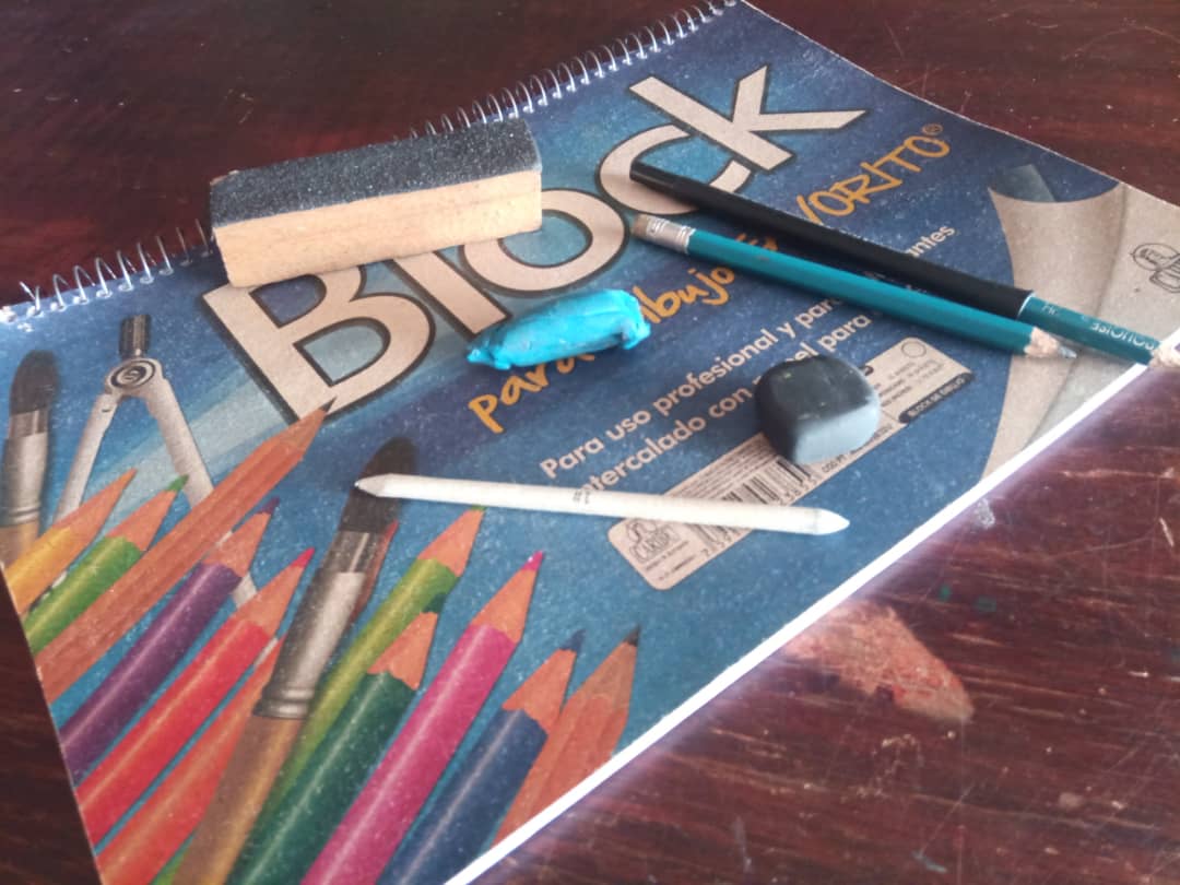
Estos son los materiales que use para poder realizar este dibujo:
Lápiz de grafito marca Prismacolor 2B y 6B.
Block de dibujo mara Caribe.
Borrador moldeable.
Difuminadora número 1
! [English version]
These are the materials I used to make this drawing:
Graphite pencil brand Prismacolor 2B and 6B.
Drawing block mara Caribe.
Moldable eraser.
Diffuser number 1
 |  |
|---|
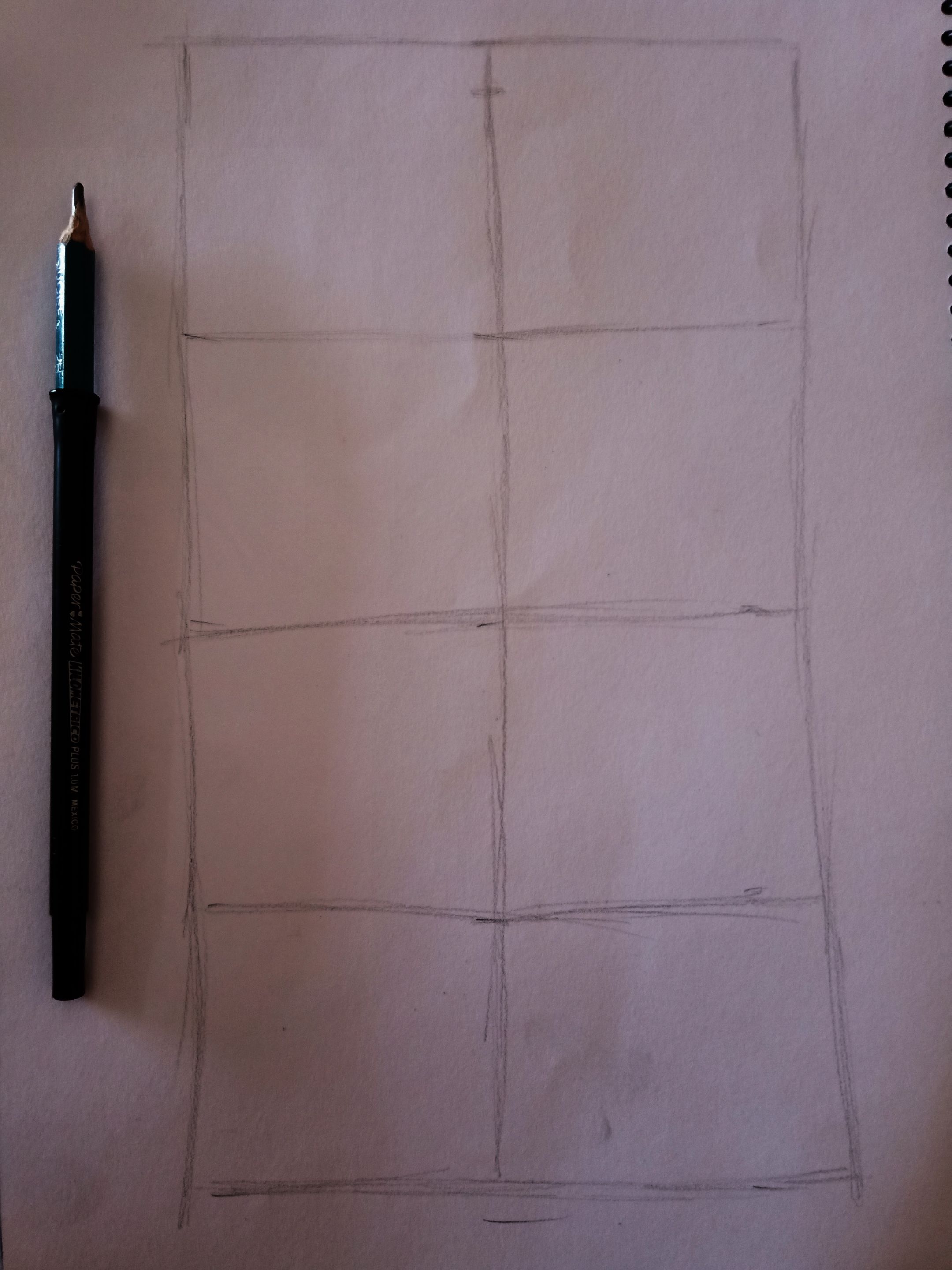
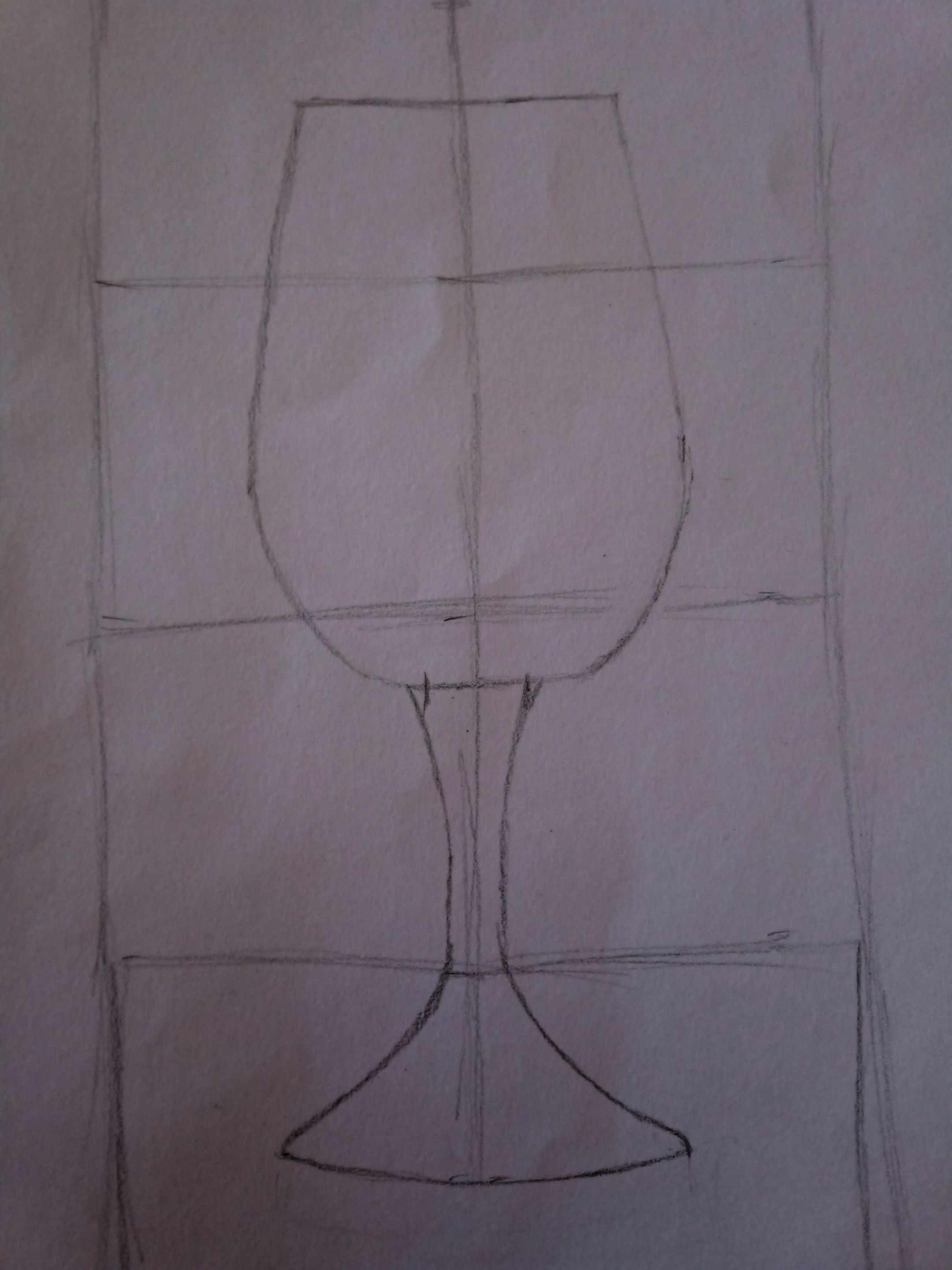
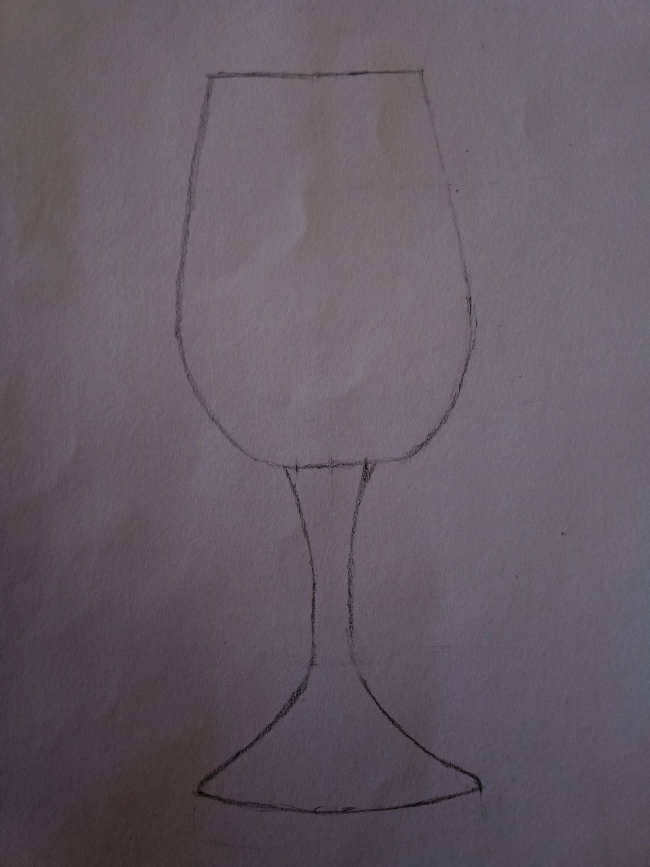
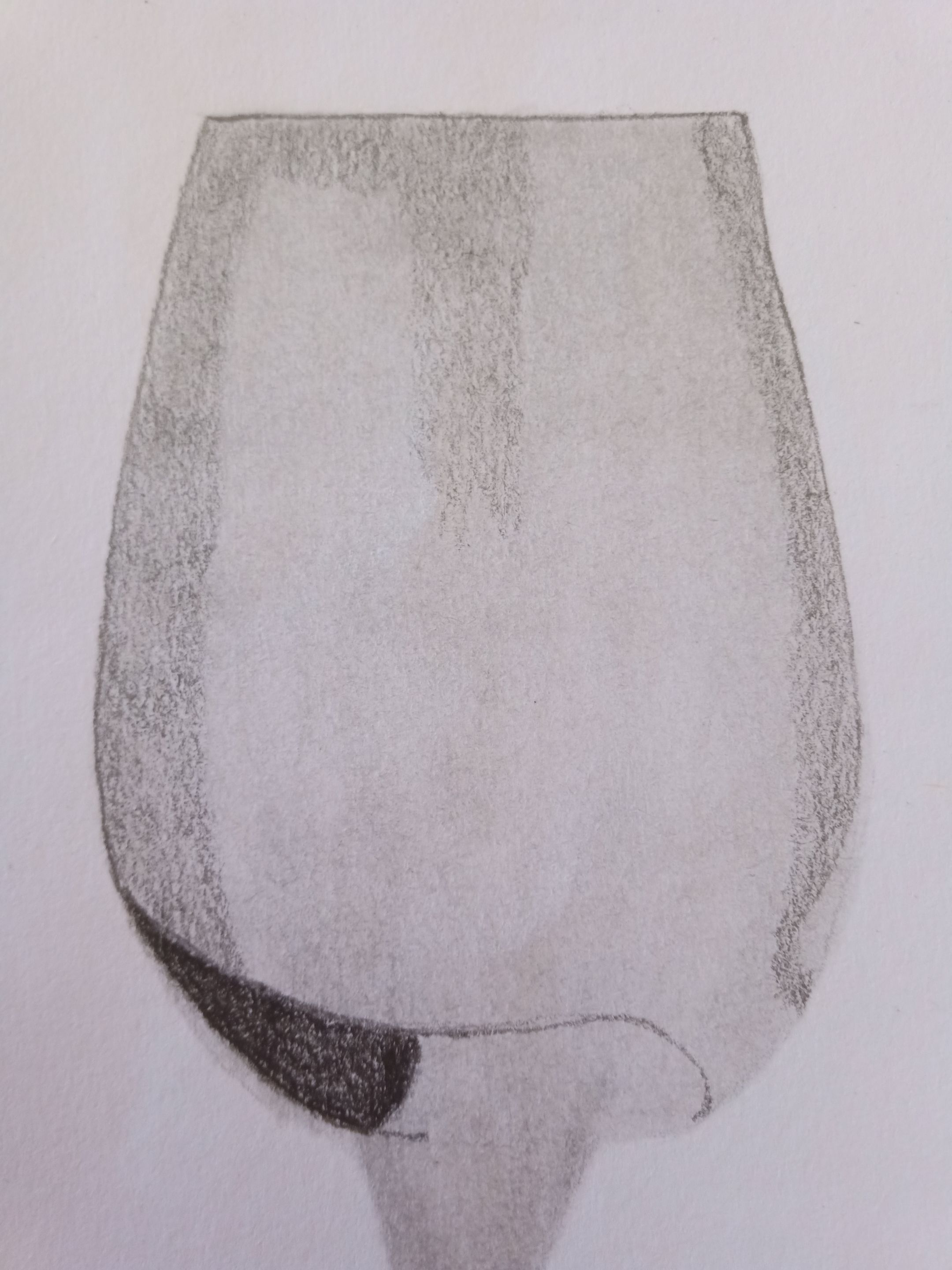
Para iniciar mi dibujo, primero comencé a usar la técnica cuadrícula para hacer que toda la estructura de mi dibujo quedara proporcionada.
Esta técnica es muy útil para todo tipo de dibujos, sinceramente, podrán notar que mi lápiz de dibujo se encuentra en el interior de una base de un bolígrafo, se encuentra de esta manera porque en vista de que el lápiz se encuentra muy gastado, me era imposible sostenerlo tan pequeño, así que se me ocurrió la idea de ponerlo en su interior para seguirlo usando un poco más hasta que me diga Estoy cansado jefe, ya no puedo continuar.
Después, dentro de cada cuadro de la técnica cuadricula, agregue cada estructura de la copa, gracias a esta técnica puedo colocar cada parte de manera perfecta, ya que soy muy detallista en los pequeños detalles.
! [English version]To start my drawing, I first started using the grid technique to make the whole structure of my drawing proportionate.
This technique is very useful for all kind of drawings, honestly, you may notice that my drawing pencil is inside a pen base, it is this way because since the pencil is very worn out, it was impossible for me to hold it so small, so I came up with the idea of putting it inside to keep using it a little more until I say I'm tired boss, I can't go on anymore.
Then, inside each square of the grid technique, I added each structure of the cup, thanks to this technique I can place each part in a perfect way, since I am very detailed in the small details.
 |  |
|---|
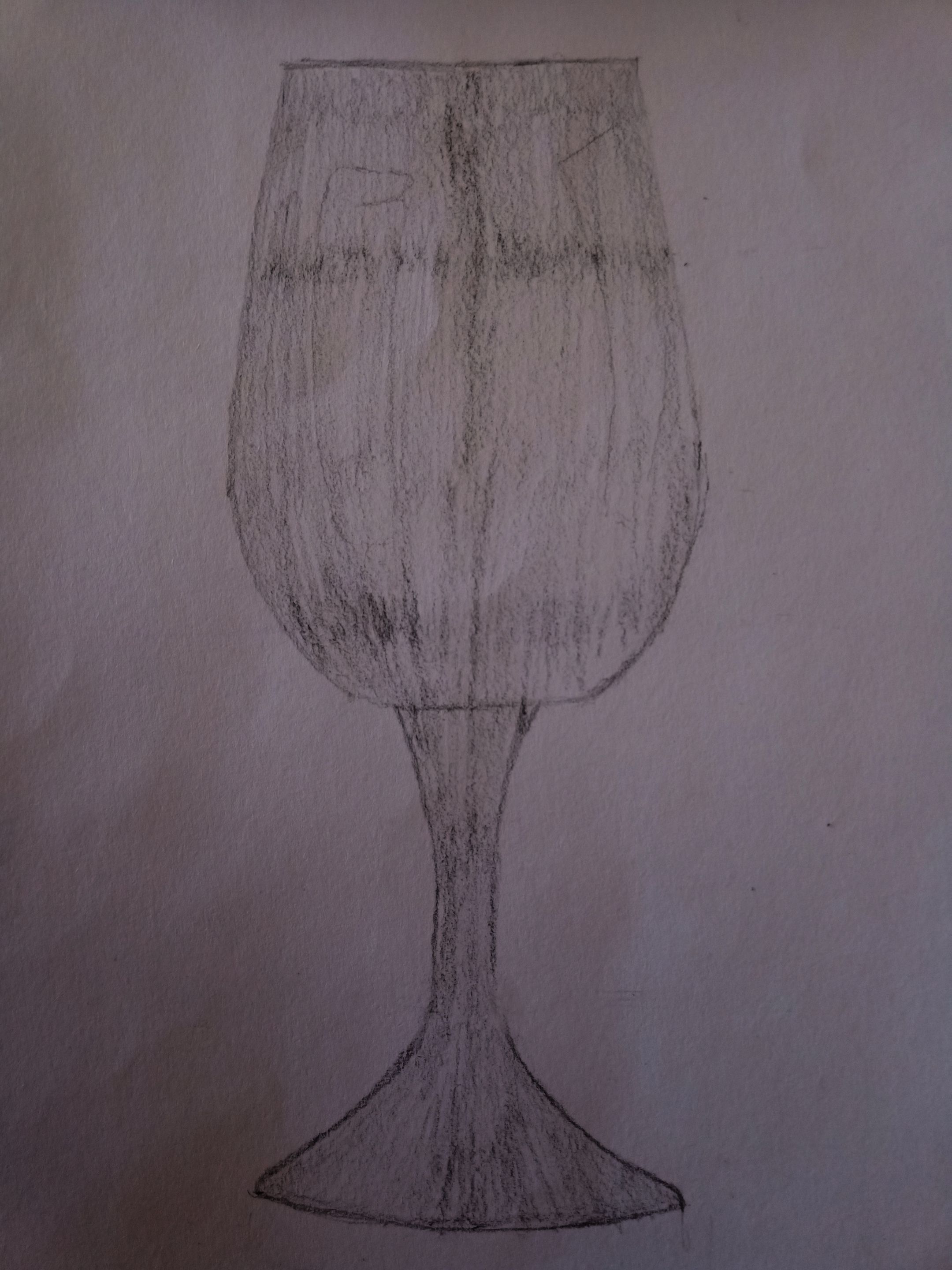
Una vez realizado la base del dibujo, borre todas las cuadriculas para que solamente se apreciara la figura de la copa, después viene mi parte favorita, darle valor al dibujo.
Esta parte es muy importante, ya que de la primera capa dependerá del realismo de nuestro dibujo, siempre tomo mi lápiz de grafito desde la parte final del lápiz, ya que esto dependerá de la presión que le apliquemos al lápiz para poder escribir o dibujar.
Al momento de valorizar mi dibujo me di cuenta de una cosa que me paso por un error que cometí antes y esperaba de que esto no fuera un problema, resulta que cuando borre la técnica cuadriculada, las porosidades de mi block de dibujo se abrieron producto del borrador, dándome como resultado a la hora de valorizar, esas cruces y partes más oscuras, ya que eran donde se encontraban las líneas de dicha técnica que use anteriormente.
Nota: notarán que en algunas fotografías unas están más oscuras que otra, esto es debido a que en el momento de tomar las fotos, por la iluminación que había en ese momento, en algunas fotografías no se podía apreciar muy bien las líneas, así que he tenido que editarlas para oscurecerlas un poco.
! [English version]
Once the base of the drawing was done, I erased all the squares so that only the figure of the cup could be appreciated, then comes my favorite part, to give value to the drawing.
This part is very important, since the realism of our drawing will depend on the first layer, I always take my graphite pencil from the end of the pencil, since this will depend on the pressure that we apply to the pencil to be able to write or draw.
At the moment of valuing my drawing I realized something that happened to me by a mistake I made before and I hoped that this was not a problem, it turns out that when I erased the gridded technique, the porosities of my drawing pad opened product of the eraser, giving me as a result at the time of valuing, those crosses and darker parts, since they were where the lines of that technique I used before were.
Note: you will notice that in some photographs some are darker than others, this is because at the time of taking the photos, due to the lighting that was at that time, in some photographs the lines could not be appreciated very well, so I had to edit them to darken them a little.
 |  |  |
|---|
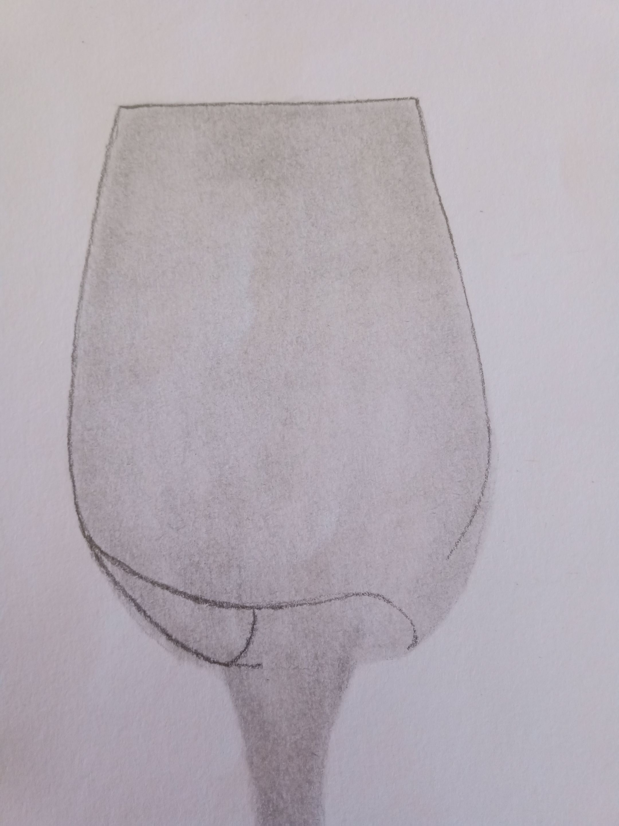
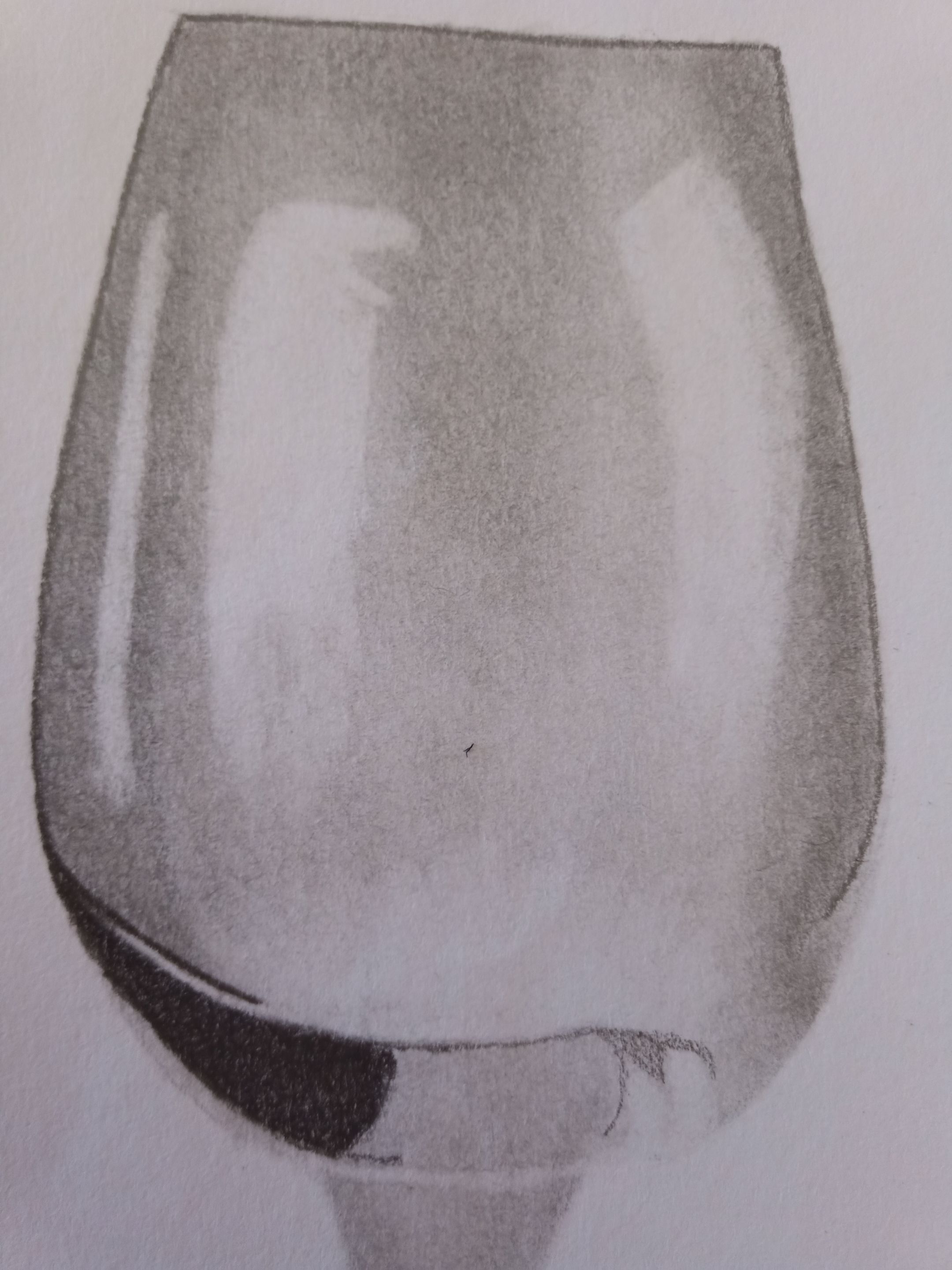
Luego de tener la primera capa ya valorizada, comencé a difuminar toda el área que anteriormente le había dado valor con mi lápiz de grafito 2B, el número de la difuminadora que use fue el 1, ya que este es el más delgado y pequeño que podemos usar para dibujos de este tamaño.
Después, con el lápiz 6B, comencé a agregar las bases de donde partirá las profundidades del dibujo y el sombreado. Acto seguido, con el mismo lápiz 6B, comencé a marcar las áreas con más sombras, en una de ellas se encuentra la parte que va quedando a la base de la copa, el mismo si revisamos una copa real, tiene esa zona que hace que se vea más oscuro.
! [English version]
After having the first layer already valued, I started to blur all the area that I had previously given value with my 2B graphite pencil, the number of the blender I used was 1, since this is the thinnest and smallest that we can use for drawings of this size.
Then, with the 6B pencil, I started to add the bases from where the depths of the drawing and the shading will start. Then, with the same 6B pencil, I began to mark the areas with more shadows, in one of them is the part that will remain at the base of the cup, the same if we review a real cup, it has that area that makes it look darker.
 |  |  |
|---|
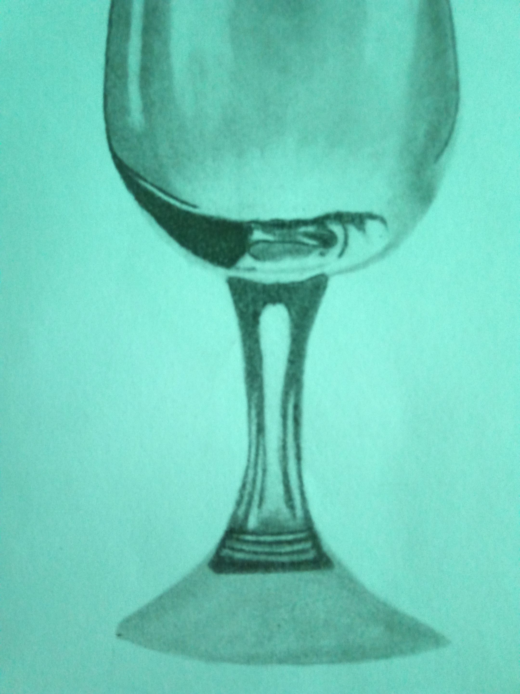
Una vez marcada las áreas que le dan ese toque de profundidad al dibujo, lo volví a difuminar con la difuminadora que había mencionado anteriormente. Después, con la ayuda del borrador moldeable, comencé a darle los espacios de iluminación, los mismos fueron trabajados delicadamente para poder crear ese degradado realista, ya que el estilo de dibujo que hago en tradicional, es buscando ese realismo o bien semi realismo.
Seguidamente, comencé a trabajar con la base de la copa, aplicando mucha más oscuridad y profundidad a cada estructura de mi dibujo, difuminando y degradando las partes donde deberían de estar en el sombreado e iluminación.
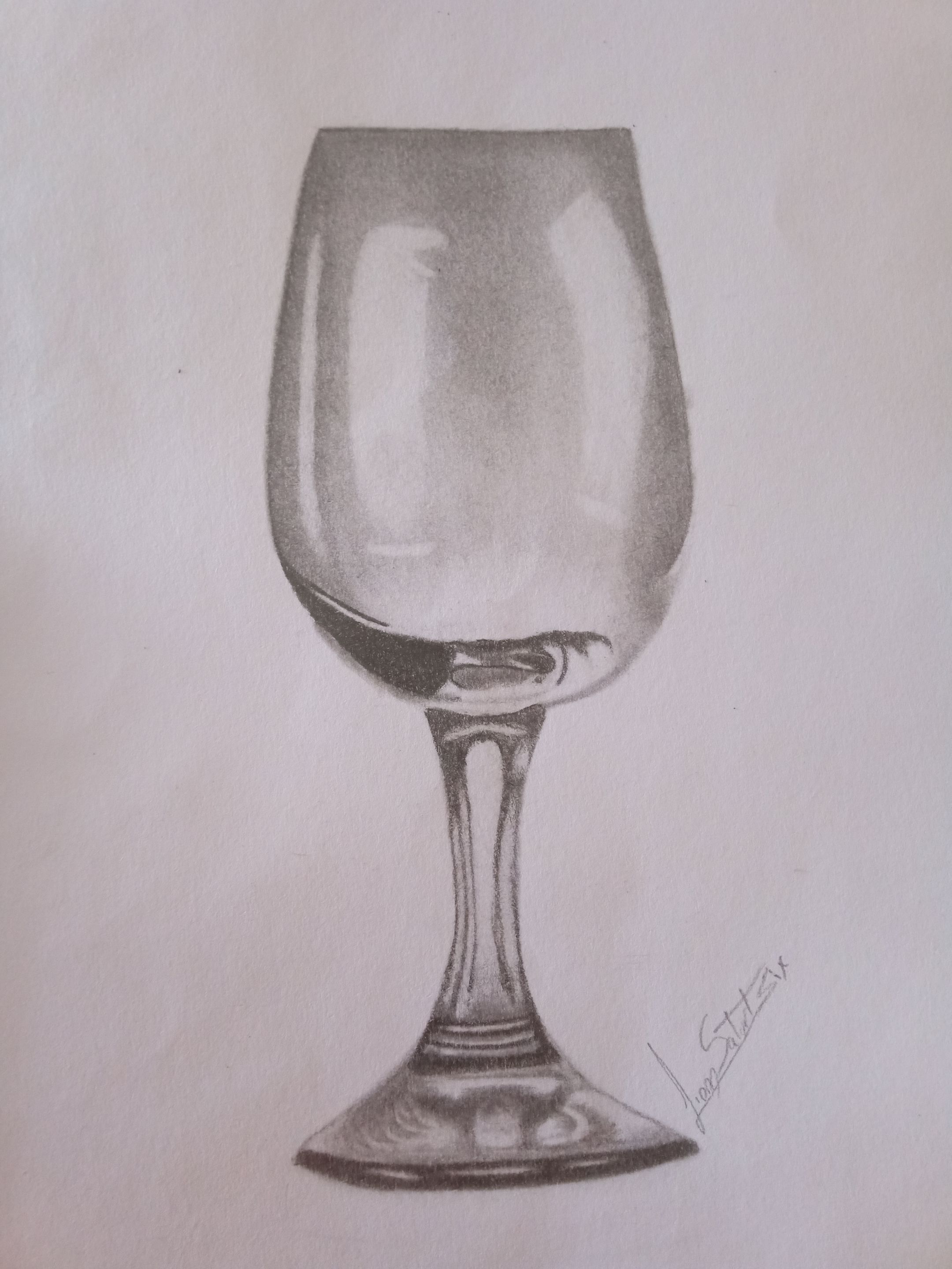
De esta forma pude realizar este fantástico dibujo, puede que la base no me haya quedado del todo bien, pero la práctica hace al maestro, aun así, estoy muy satisfecho con esta práctica, ya que pude dominar aún más el estilo de valorizado a escala de grises.
Muchas gracias por llegar hasta aquí en mi publicación, espero les sea de su agrado, hasta la próxima.
! [English version]
Once I marked the areas that give that touch of depth to the drawing, I blurred it again with the blender that I had mentioned before. Then, with the help of the moldable eraser, I began to give the illumination spaces, which were delicately worked to create that realistic gradient, since the style of drawing that I do in traditional, is looking for that realism or semi realism.
Next, I began to work with the base of the cup, applying much more darkness and depth to each structure of my drawing, blurring and degrading the parts where they should be in the shading and lighting.
In this way I was able to make this fantastic drawing, the base may not have been quite right, but practice makes perfect, even so, I am very satisfied with this practice, as I was able to master even more the style of grayscale valorized.
Thank you very much for coming this far in my publication, I hope you like it, until next time.
Source


Discord
LionSaturBix#7545
Los separadores son de mi autoría, las imágenes tienen su fuente, las fotografías fueron tomadas con la ayuda de mi teléfono Bison X Umididi, las ediciones del GIF son creados por mí.
The separators are authored by me, the images have their source, the pictures were taken with the help of my Bison X Umididi phone, the GIF edits are created by me.
Programas que utilicé para crear mi diseño es este:
This is the program I used to create my design:
Gif y portada cortesía de Canva
Gif and cover courtesy of Canva
Traducido por Deepl