Spoiler: This post is all about how I am not a graphic designer! (but I try...)
The line between graphic design and art can get kind of blurry. The official definition is the art or skill of combining text and pictures in advertisements, magazines, or books. There's definitely some overlap but I am first and foremost an artist. Creating compelling graphic designs that mix art and text doesn't look that difficult however I find myself struggling with keeping things simple.
here is a promo I made for my Subliminal Skies collection:
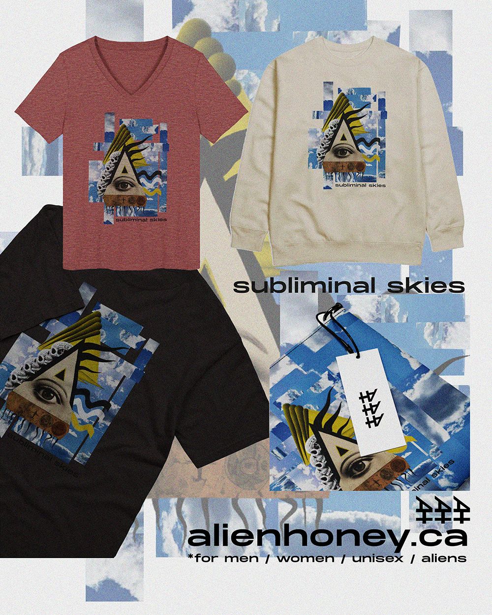
I like it and I feel like it's me but is it too busy? Should I remove the noise and grain and keep it more crisp? IDK lol. I have many different versions but this is the one I landed on...
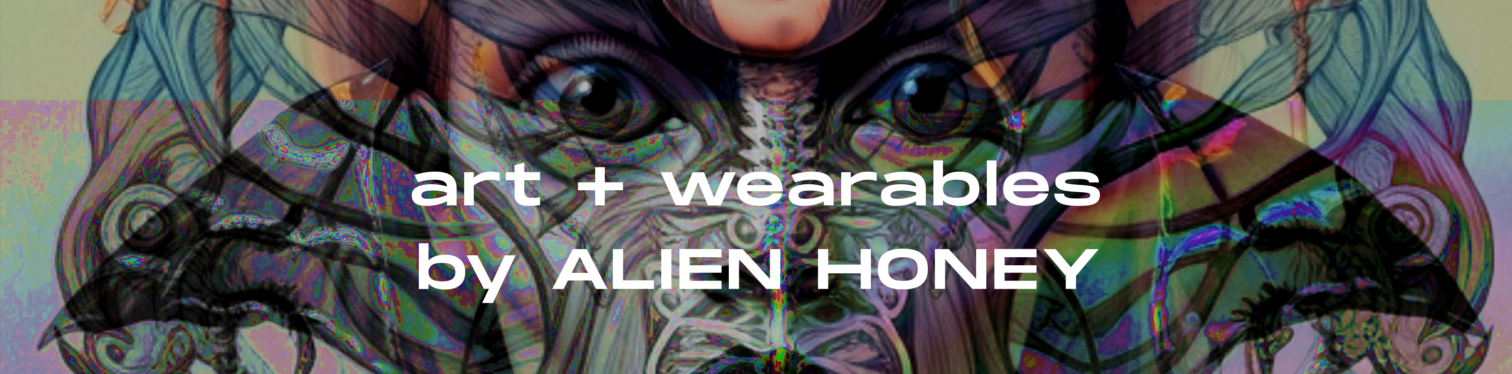
I also redesigned my shop banner, I loved the other one I made to represent my art but it didn't represent my actual products very well!
https://alienhoney.ca/
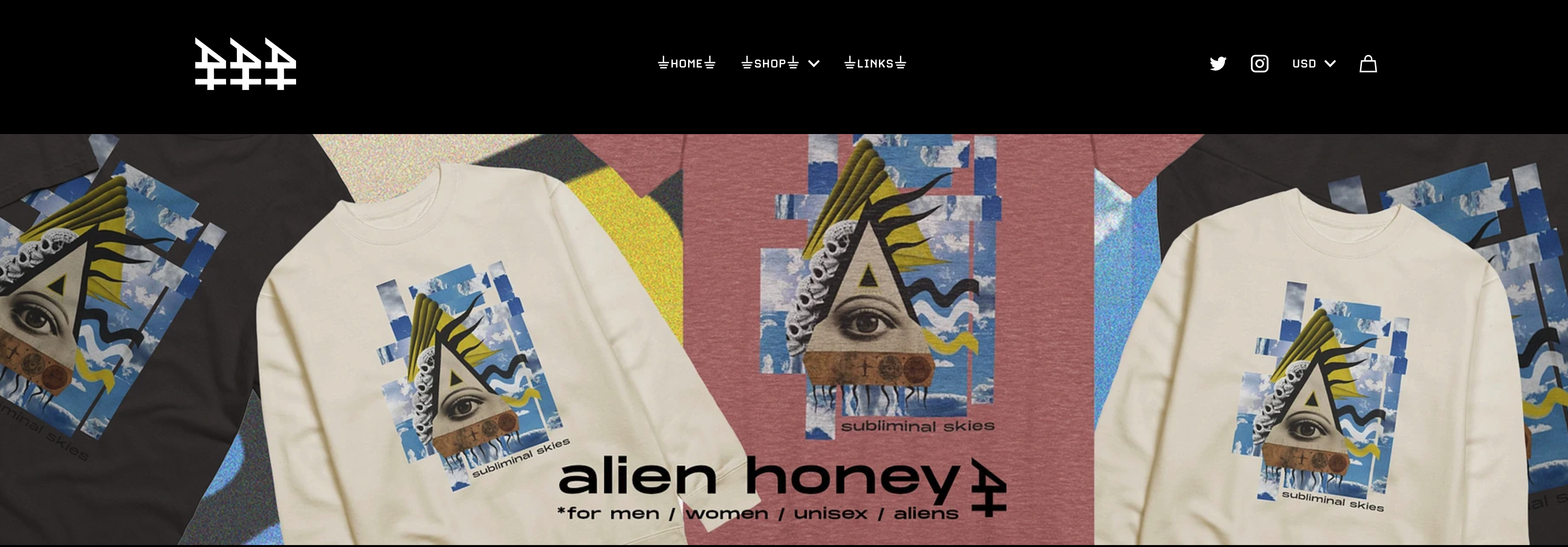
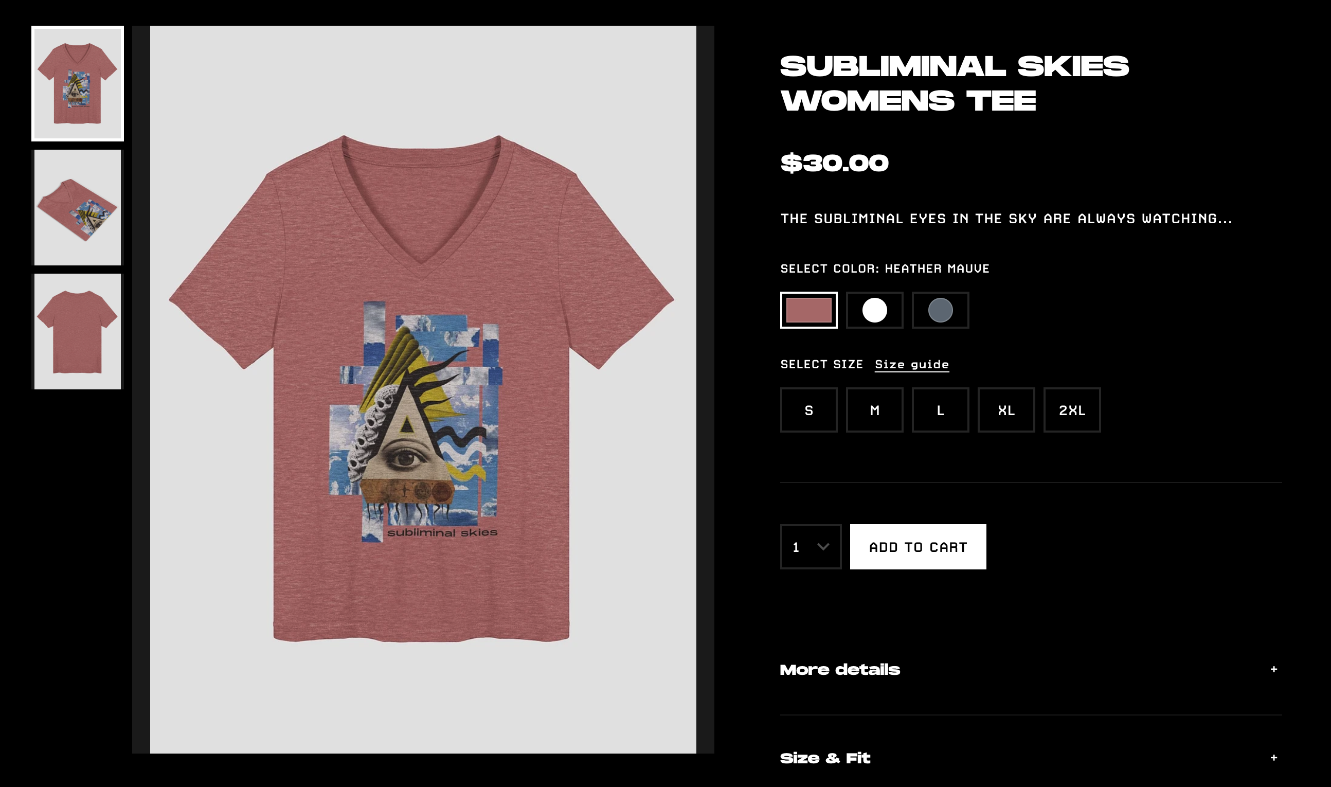
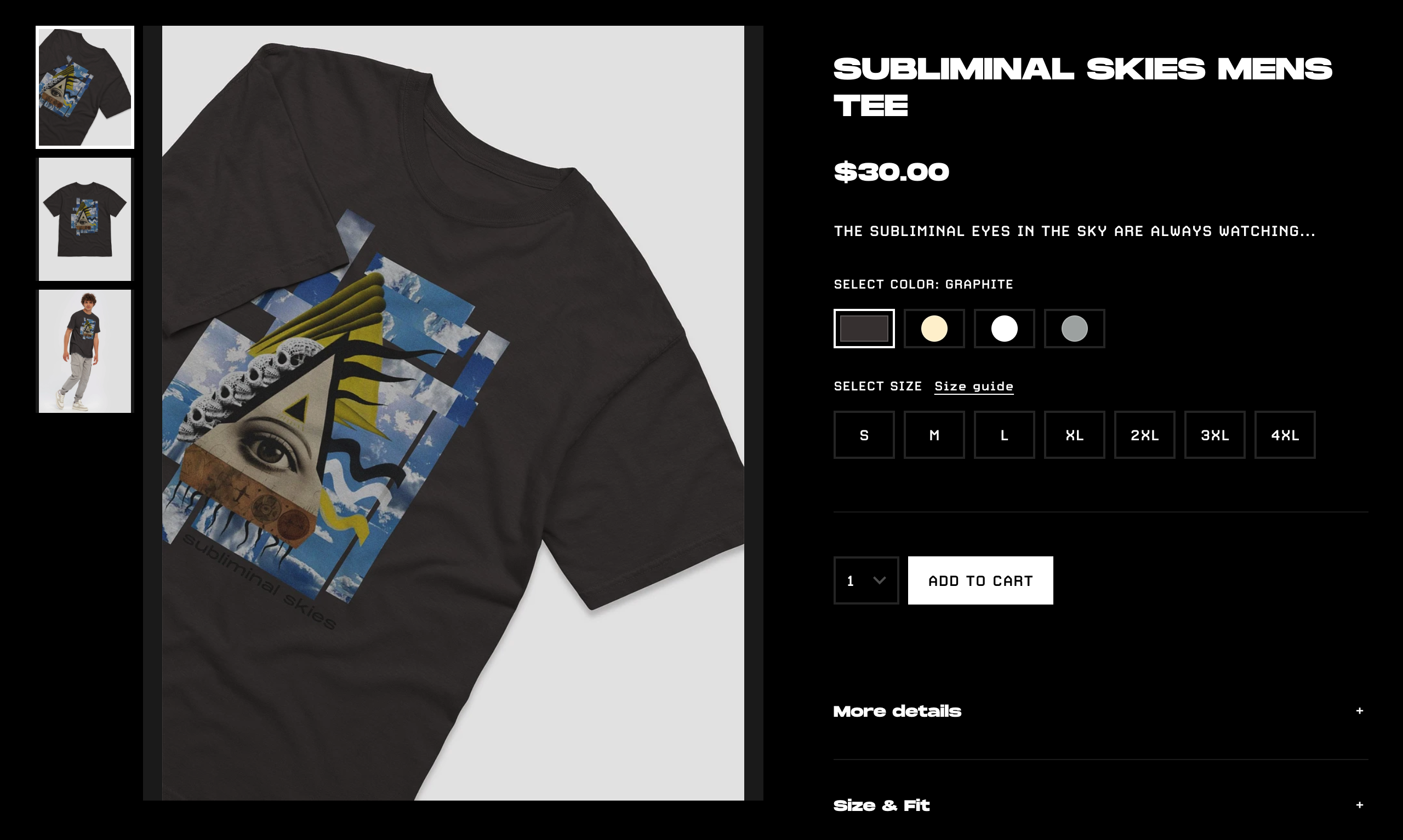
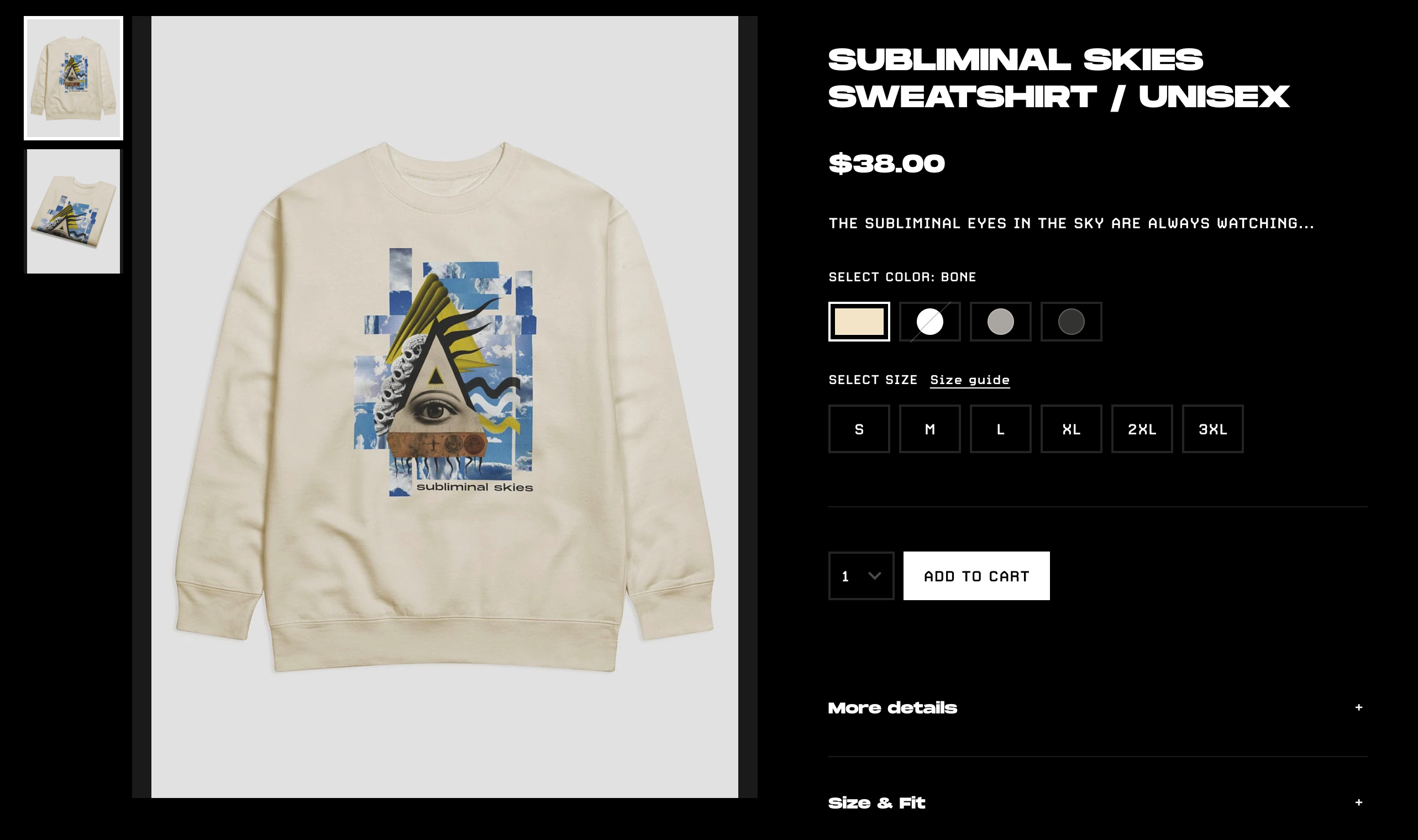
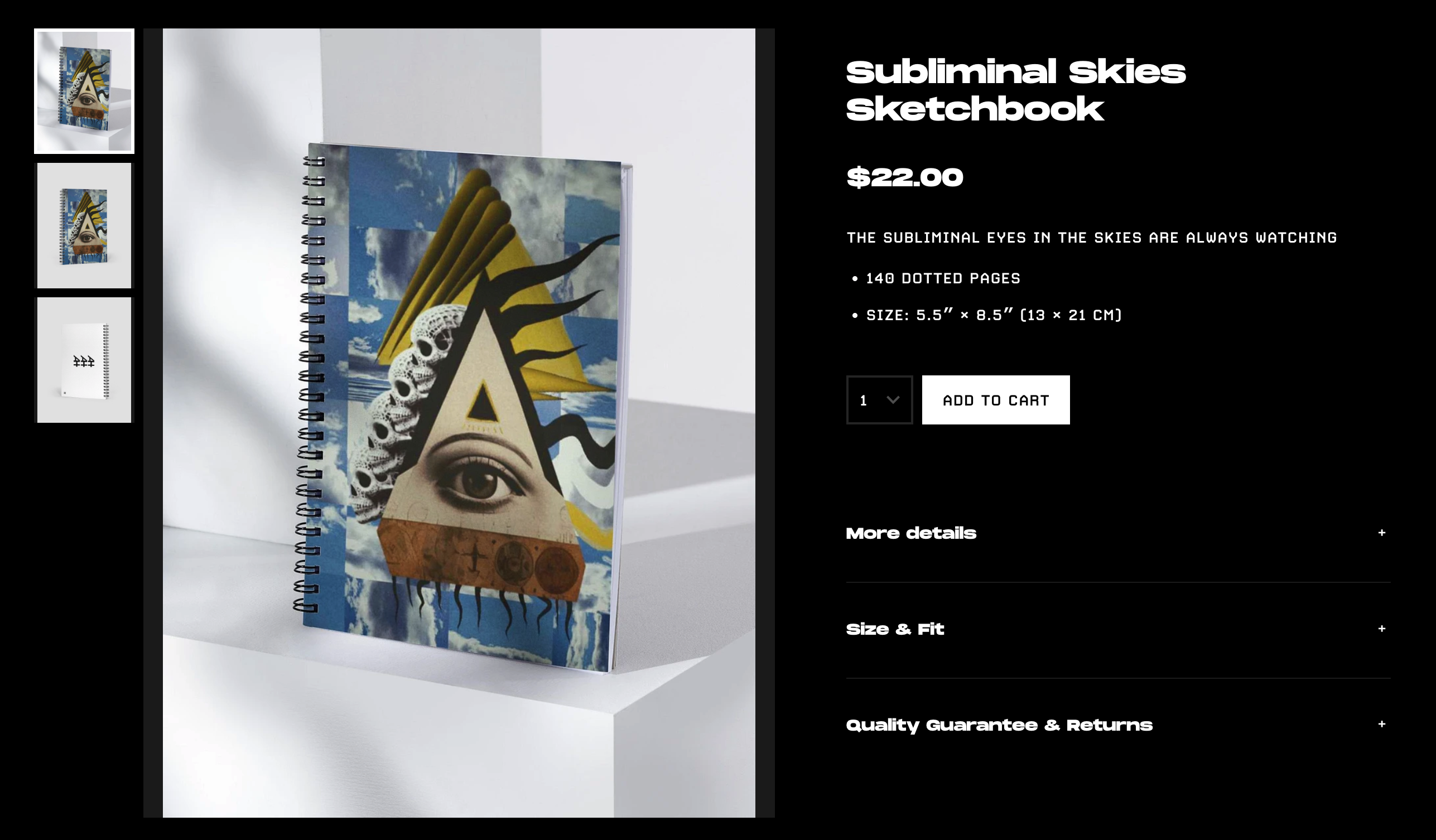
I also made some graphics specifically for one of the thumbnails but decided to keep the other ones simple, here is the collection so far:
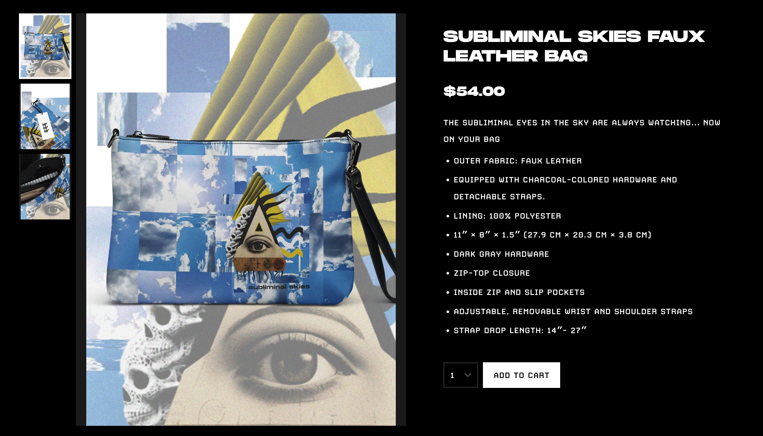
SUBLIMINAL SKIES FAUX LEATHER BAG
SUBLIMINAL SKIES WOMENS TEE
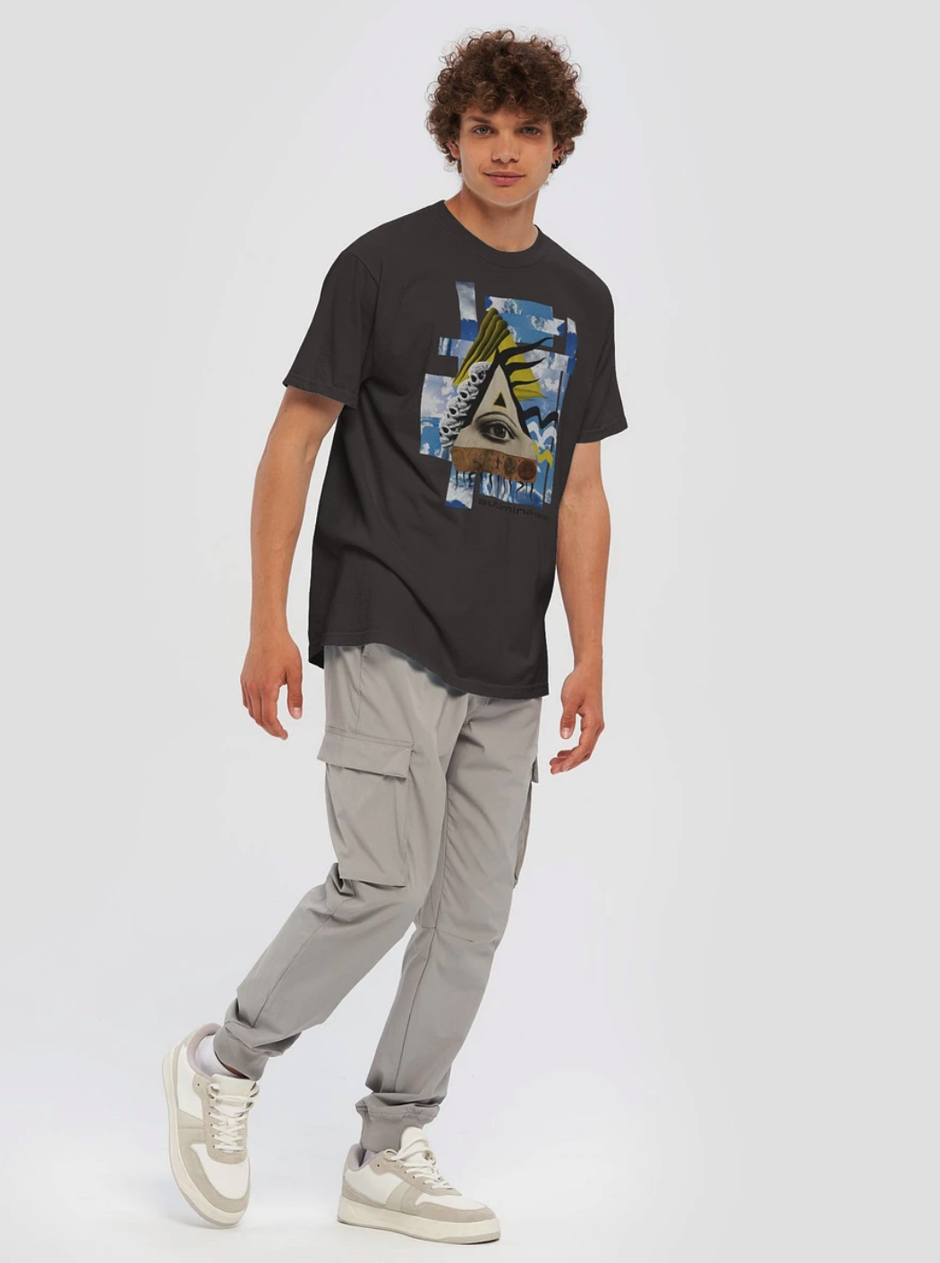
SUBLIMINAL SKIES MENS TEE
SUBLIMINAL SKIES SWEATSHIRT / UNISEX
Subliminal Skies Sketchbook
I'd be curious to hear your opinion, when you are shopping online do you get pulled in by more busy thumbnails or do you prefer it simple? Do you like seeing just the product or do you prefer seeing it on a body like this? (not all the blanks I use offer this which makes things a bit tricky...):
To follow on twitter, personal account, Alien Art Hive Community account <3