
English
Hiii, friends of the Alien Art community, how are you this time? I hope you're very well!
Today I bring you, once again, an old drawing that I had not been able to upload. Currently, I'm practicing daily and I haven't done a drawing properly for a month.
This was one of the drawings I liked the most, but it also has several mistakes, according to me, which I will mention later; however, it is not so bad. So, without further ado, join me in this process, here we go!

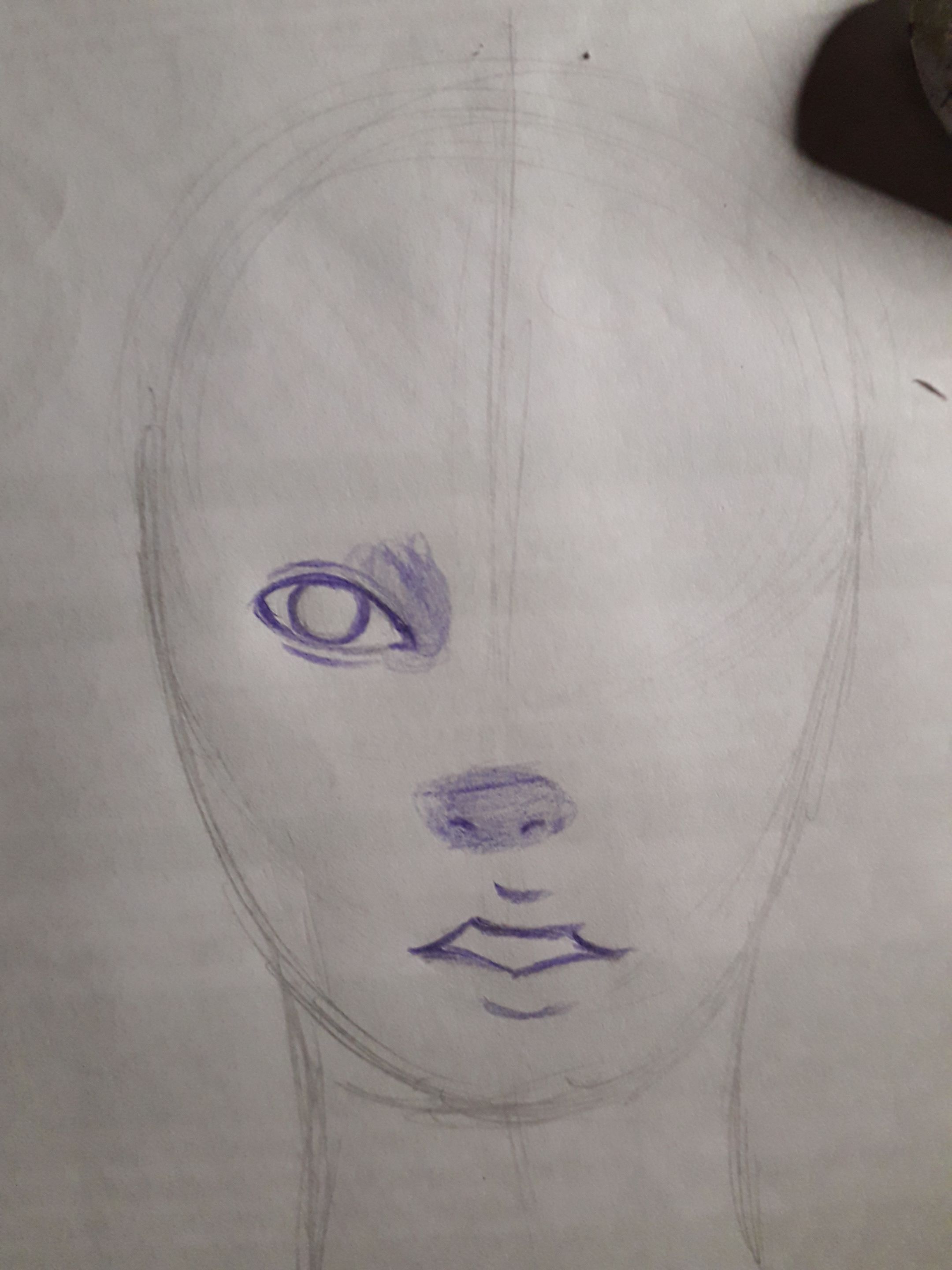
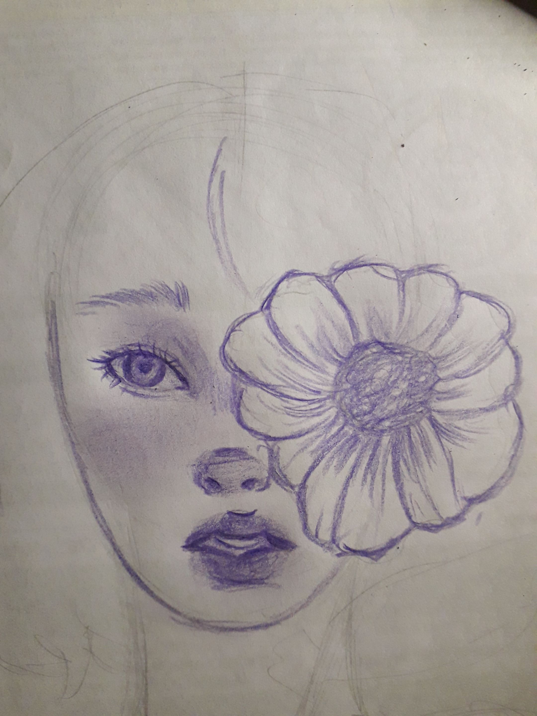
At first I started by making a pencil sketch, trying to make the basic shapes of each element of the face (eyes, nose and mouth).
However, here I have conflict: the head. Although in this drawing the proportions are not so bad, I drew the head as a plain oval. I didn't make a base with guidelines, and I feel that this is one of the most notable problems of the drawing, according to me.
Another mistake I made was the simplification of the elements of the face. The eyes: by themselves are not bad, but I started drawing only one and plain. I think that to draw this element better, you have to start from a base figure. Also, I forgot to determine the distance between the two eyes. I don't know, in general I feel that it's too flat.
The nose: it's too simplified, I didn't even draw the shape of the septum or the space between the eyebrows. It's not exactly bad, but I feel that these mistakes make it difficult for me to know how to place the shadows, besides, again it looks very flat. But well, it's a sketch, I can't be too picky either, although these are things I don't do anymore.
The mouth: I didn't draw the lips, so I don't even know what shape they will have. Those strokes, you can see there, only determine the opening of the mouth.
All wrong, but I would like to know if you want me to redraw it now that I'm learning a little more how to draw faces, I think I'll start redrawing my old drawings to see what new air they have, how about it?
 |  |
|---|
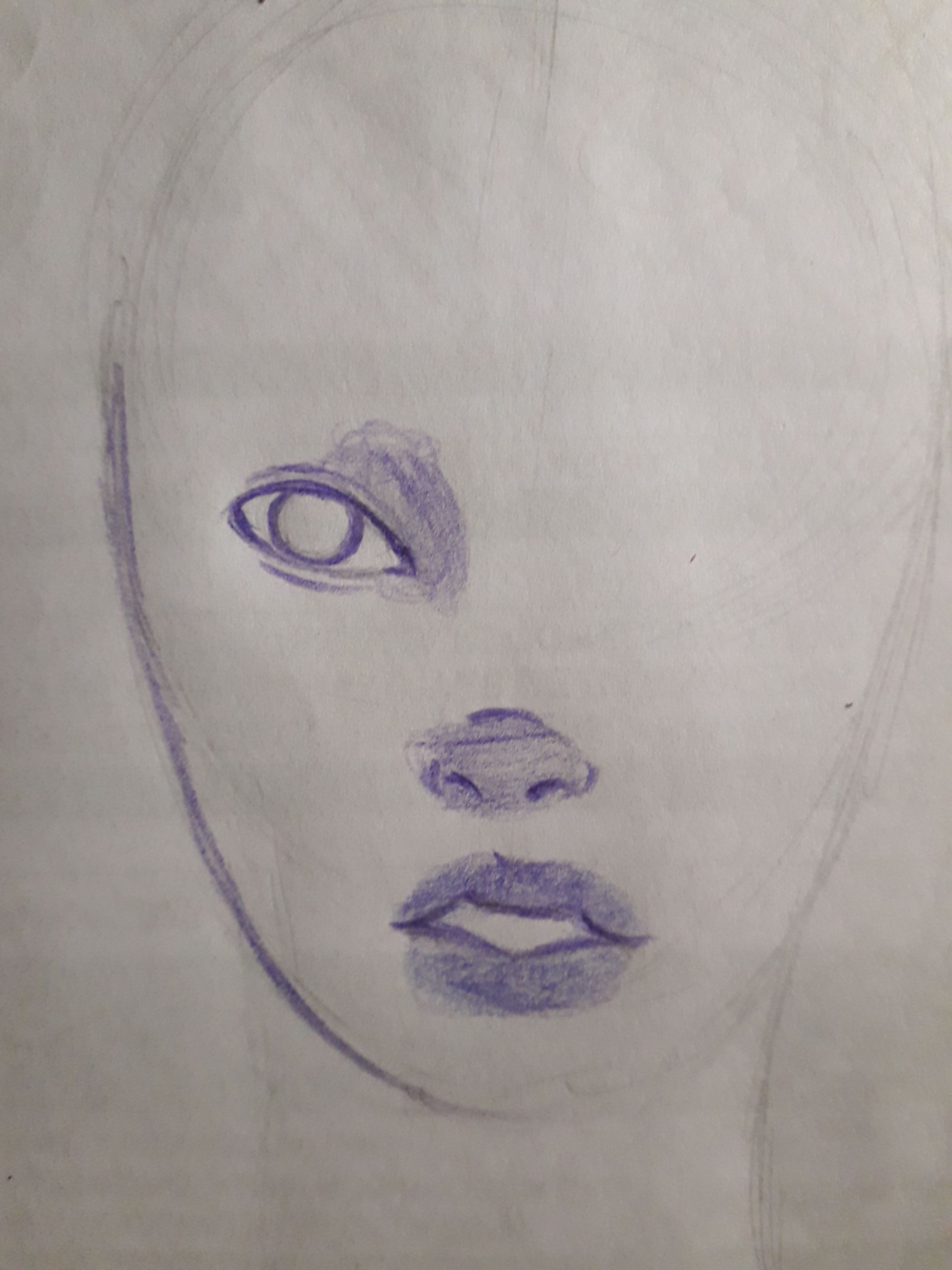
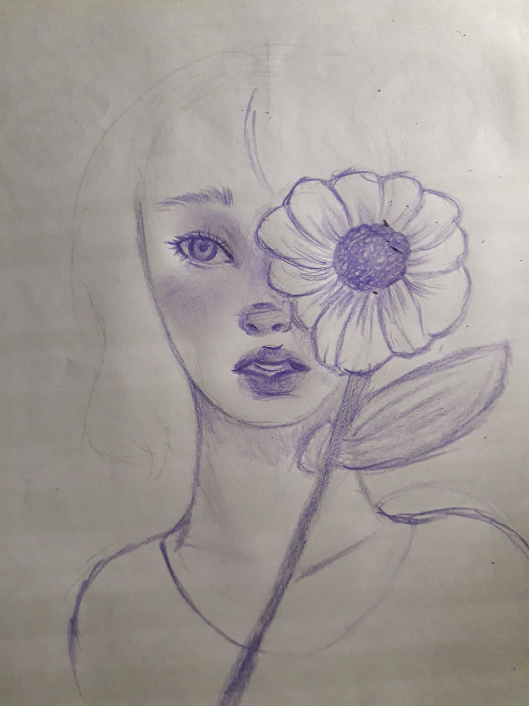
I started drawing with the purple crayon. Basically, I just started to give shadows, or color, where I liked the most.
Actually, now I feel it's not so bad, but the eyes and the nose are still causing me conflict, but I like the mouth, although it's very simple, for the moment.
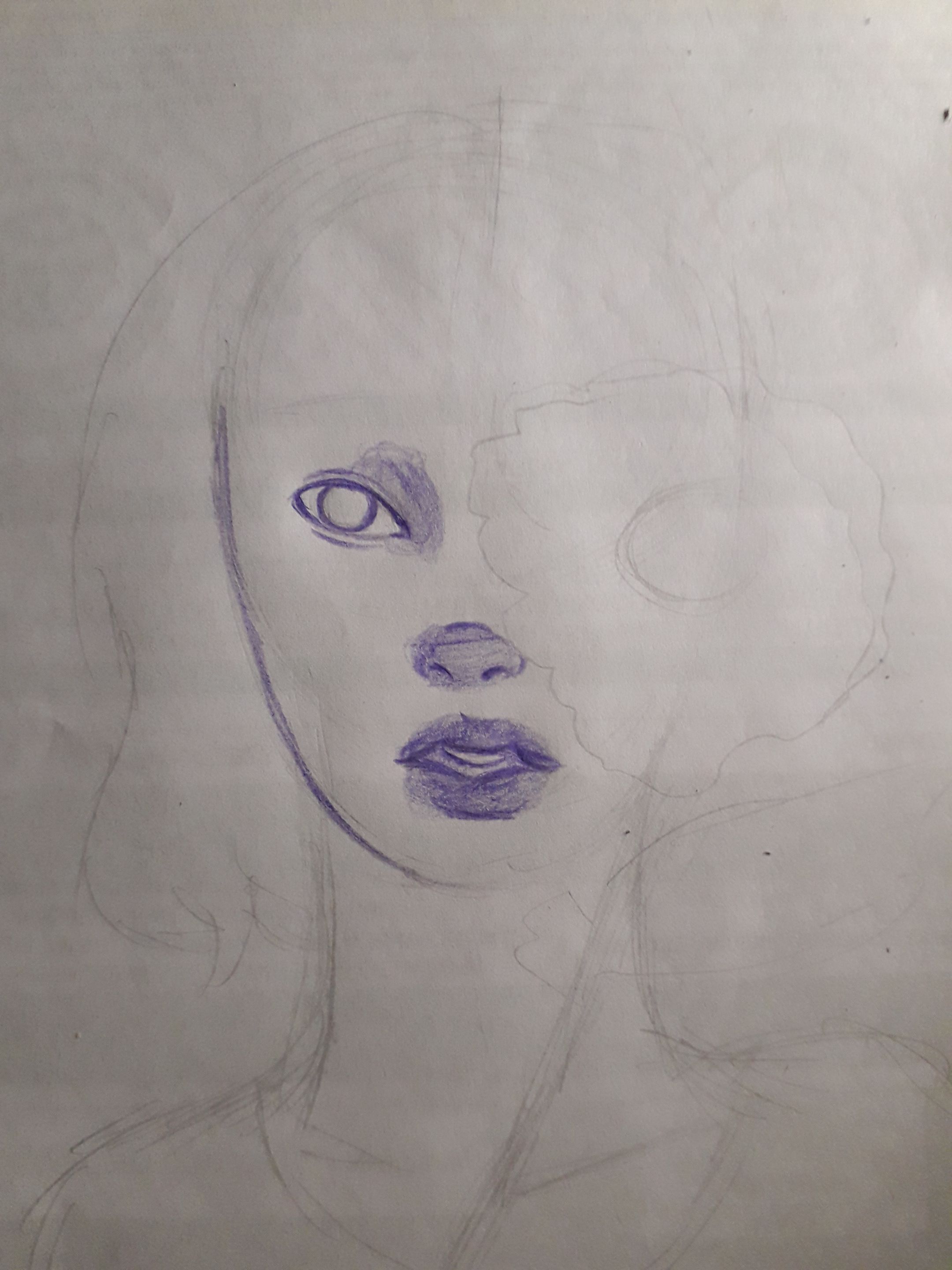
Here I sketched the rest of the elements in the drawing, like the flower, the hair, and the shoulders. I don't know why I drew the neck so long, it makes me laugh to see it now, although I don't know if there is a correct neck length, as I have met people with very long necks and others with shorter necks.
I also gave more details to the lip, but here I didn't like it, I made the teeth weird. But well, being aware of mistakes is the first step to learn and improve.
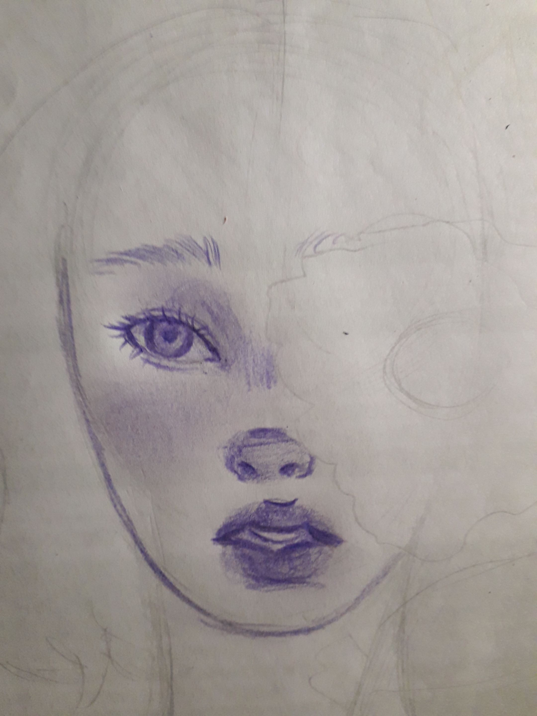
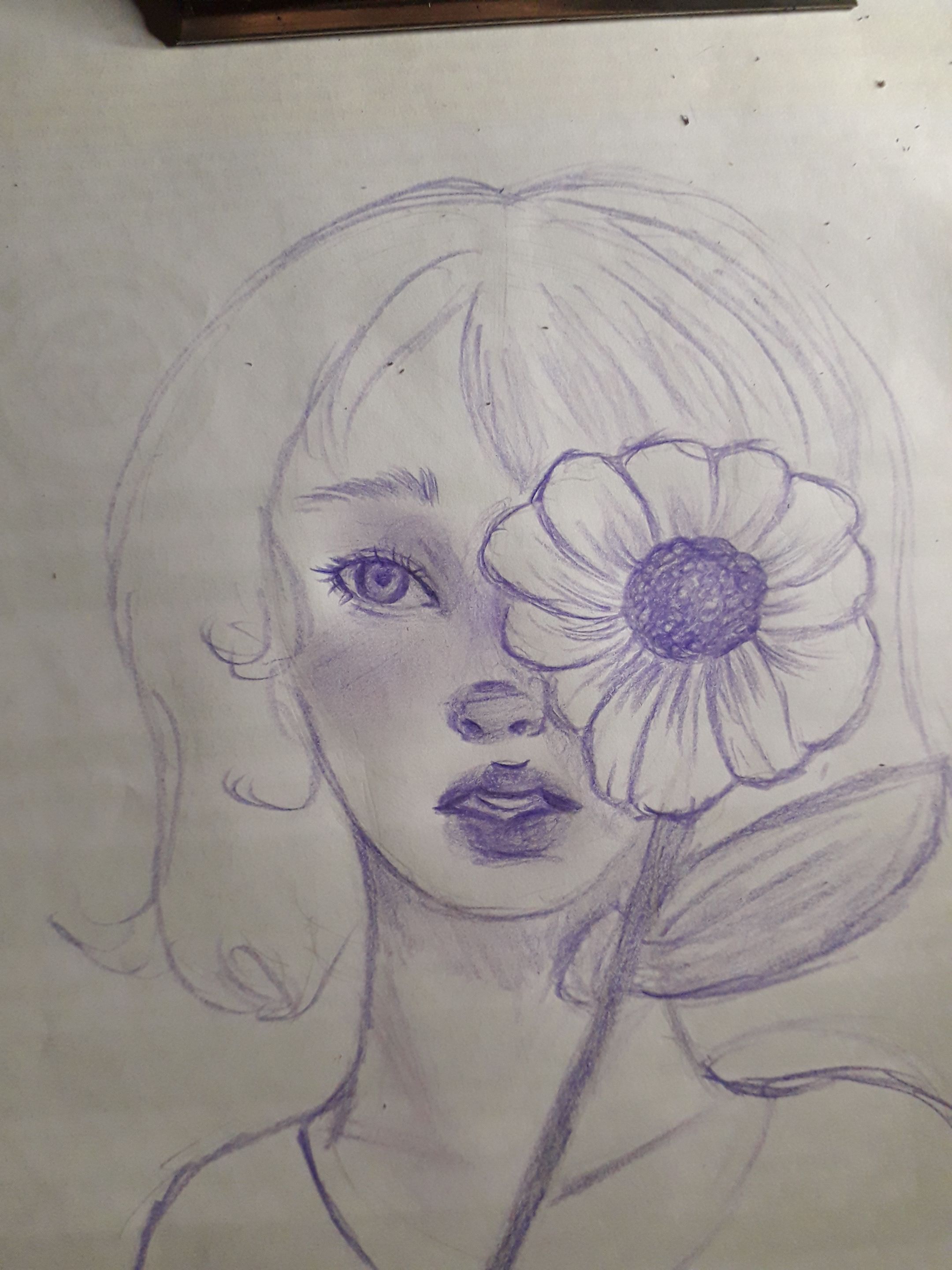
Here I admit that I started to like the drawing. For example, I improved the eyes giving them a little more depth. Although I missed some details such as the tear trough, the edge of the lower eyelid and the corner of the eye. I feel that with these details, it would have been much better.
However, it's not too bad. For example, I drew the eyelashes and eyebrows, whose finish I liked a lot.
I also drew the nostrils and the fins of the nose. The bad thing is that I drew some strokes on the septum of the nose that don't make much sense, because there shouldn't be any shadow there.
I also smudged color on the cheek, to give it color, like blush.
I liked the mouth, but not the teeth, too bad.
 |  |
|---|
I drew the flower. There is not much science in this, I simply made the round part of the center giving color in a circular way and with small strokes. I gave shadows on the petals and at the growing point of the petals, in shapes of several smooth lines. I gave color to the whole stem and drew the leaves with many lines following the direction of their growth.
It's not an amazing flower by any means, it's just a flat and static flower, to be honest, but I liked it.
I also remarked a bit the silhouette and direction of the hair.
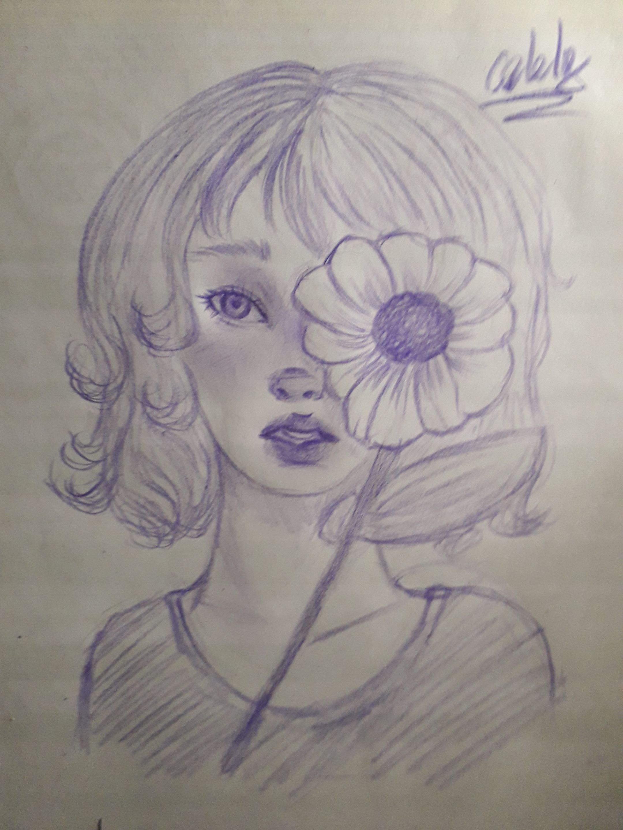
Finally, I made strokes on the hair in the direction of growth and also gave some shadows. I must admit that the hair did not please me at all. Not having a well established and measured skull structure, I lost track of where to draw the hair and the volume of the hair, it doesn't have a round shape either as such.
I also drew the neck and gave shadow, and the shoulders along with the shirt and a quick striped coloring to finish with this drawing.
It has a lot of mistakes, but it's not really bad either. I liked this drawing because it expresses the desire I had to make an improvement with my drawings, but I didn't have the knowledge of how to do it. Now I am happy, because I have improved remarkably, although my path as an artist is just beginning, even though I have been drawing for as long as I can remember.
As a moral, I would tell you to never stop learning, not only in the artistic field, but in whatever you like or need. It is always good to learn, even if it seems minimal.
Without anything else to add, take care, drink water, and don't forget to smile, I love you, see you in the next post, bye!
Español
Holiii, amigos de la comunidad de AlienArt, ¿cómo se encuentran en esta ocasión?, ¡espero que muy bien!
Hoy les traigo, nuevamente, un dibujo algo antiguo que no había podido subir. Actualmente, estoy practicando diariamente y llevo un mes sin hacer un dibujo propiamente.
Este fue un dibujo de los que más me gustó, pero también tiene varios errores, según yo, que mencionaré más adelante; sin embargo, no está tan mal. Así que, sin más, acompáñenme en este proceso, ¡vamos allá!
Al principio comencé por hacer un boceto a lápiz, intentando hacer las formas básicas de cada elemento del rostro (ojos, nariz y boca).
Sin embargo, aquí tengo conflicto: la cabeza. Aunque en este dibujo las proporciones no están taaan mal, dibujé la cabeza como un óvalo sin más. No hice una base con líneas guía y siento que este es uno de los problemas más notables del dibujo según yo.
Otro error que cometí fue la simplificación de los elementos del rostro. Los ojos: de por sí no están mal, pero comencé dibujando uno solo y de forma plana. Creo yo que para dibujar mejor este elemento, hay que partir de una figura base. Además, olvidé determinar la distancia entre los dos ojos. No lo sé, en general siento que quedo muy plano.
La nariz: es demasiado simplificada, ni siquiera dibujé la forma del tabique o el entrecejo. No está precisamente mal, pero siento que estos errores me dificultan saber como colocar las sombras, aparte, nuevamente se ve muy plana. Pero bueno, es un boceto, tampoco puedo ponerme muy exigente, aunque son cosas que ya no hago.
La boca: no dibujé los labios, por lo que no sé ni siquiera que forma van a tener. Esos trazos que se ven ahí, únicamente determinan la abertura de la boca.
Todo mal, pero quisiera saber si quieren que lo redibuje ahora que estoy aprendiendo un poco más como dibujar rostros, creo que comenzaré a redibujar mis viejos dibujos para ver qué aire nuevo tienen, ¿qué tal?
| |
|---|
Comencé a dibujar con el lápiz de color morado. Básicamente, solo comencé a dar sombras, o color, donde más me gustara.
La verdad, ahora siento que no está tan mal, pero los ojos y la nariz me siguen causando conflicto, pero me gusta la boca, aunque está muy simple, de momento.
Aquí hice un bosquejo del resto de elementos en el dibujo, como la flor, el cabello, y los hombros. No sé por qué dibujé el cuello tan largo, me da risa verlo ahora, aunque no sé si exista una longitud correcta de cuello, pues he conocido personas con el cuello muy largo y otras con el cuello más corto.
También le di más detalles al labio, pero aquí no me gustó, hice los dientes raros. Pero bueno, estar consciente de los errores es el primer paso para aprender y mejorar.
Aquí admito que me empezó a gustarme el dibujo. Por ejemplo, mejoré los ojos dandoles un poco mas de profundidad. Aunque faltaron detalles como el lagrimal, el borde del parpado inferior y la esquina del ojo. Siento que con estos detalles, hubiera quedado mucho mejor.
Sin embargo, no está tan mal. Por ejemplo, dibujé las pestañas y cejas, cuyo acabado me gustó mucho.
También dibujé las fosas nasales y las aletas de la nariz. Lo malo es que di unos trazos en el tabique de la nariz que no tienen mucho sentido, porque ahí no debería haber ninguna sombra.
También difuminé color en la mejilla, para darle color, como blush.
La boca me gustó, pero los dientes no, qué mal.
| |
|---|
Dibujé la flor. No hay mucha ciencia en esto, simplemente hice la parte redonda del centro dando color de manera circular y con trazos pequeños. Di sombras en los pétalos y en el punto de crecimiento de estos, en formas de varias líneas suaves. Le di color a todo el tallo y dibujé las hojas con muchas líneas siguiendo la dirección de su crecimiento.
Tampoco es una flor increíble ni mucho menos, es solo una flor plana y estática, la verdad, pero me gustó.
También remarqué un poco la silueta y dirección del cabello.
Finalmente, hice trazos en el cabello en la dirección del crecimiento y también di algunas sombras. Debo admitir que el cabello no me gustó en nada. Al no tener una estructura del cráneo bien establecida y medida, perdí la pista de donde dibujar el cabello y el volumen de este, no tiene forma redonda, tampoco como tal.
También dibujé el cuello y di sombra, y los hombros junto con la camisa y un coloreado rápido de rayas para culminar con este dibujo.
Tiene muchos errores, pero tampoco es que esté realmente mal. Este dibujo me gustó porque expresa las ganas que tenía de hacer una mejora con mis dibujos, pero no tenía el conocimiento de como hacerlo. Ahora estoy feliz, porque he mejorado notablemente, aunque apenas mi camino como artista está empezando, a pesar de dibujar desde que tengo memoria.
Como moraleja, les diría que nunca dejen de aprender, no solo en el ámbito artístico, sino en lo que más les guste o necesiten. Siempre es bueno aprender, aunque parezca mínimo.
Sin nada más que añadir, cuídense, tomen agua, y no se olviden de sonreír. ¡Se les quiere, nos vemos en el próximo post, chau!
Credits | Créditos
- English translation DeepL (sorry for any mistakes, I don't know much English)
- Traducción al inglés DeepL (lo siento por cualquier error, no sé mucho inglés.)
- Banners made in Canva. Dividers drawn by me
- Banners hechos en Canva. Separadores dibujados por mi.
- Reference image
- Imagen de referencia
- Photos used in the post were taken by me, using a Samsung Galaxy J6
- Las fotos usadas en el post fueron tomadas por mí, usando un Samsung Galaxy J6