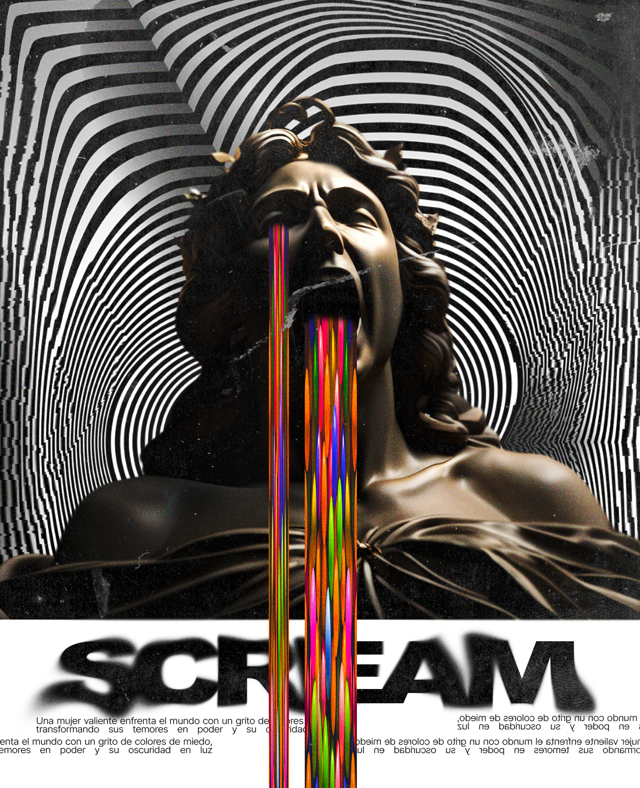
Hi Alien Art community! Today I bring another practice of a previous concept, which involves using statues with facial representations of screams, sadness, and more. I also used a background that creates a certain illusion and depth. I hope you enjoy the process we're going through.
¡Hola comunidad de Alien Art! Hoy les traigo otra práctica basada en un concepto anterior, que consiste en utilizar estatuas con representaciones faciales de gritos, tristeza y más. También he utilizado un fondo que crea cierta ilusión y profundidad. Espero que disfruten del proceso que estamos llevando a cabo.
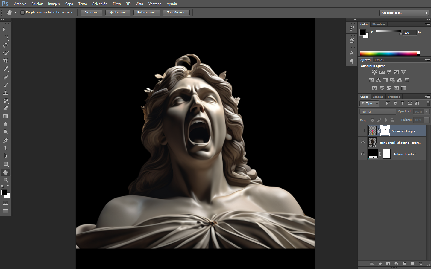
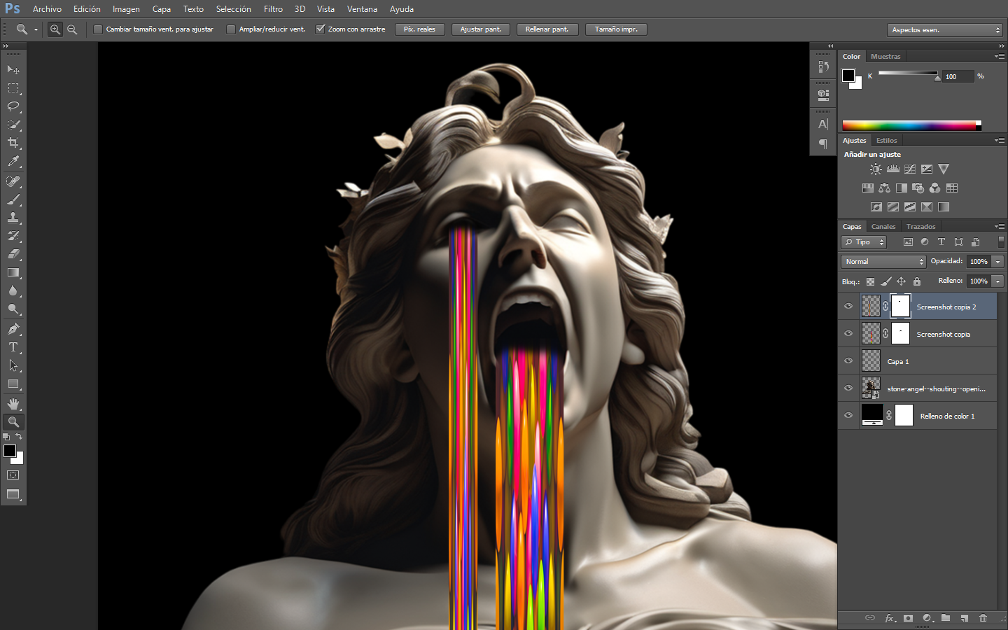
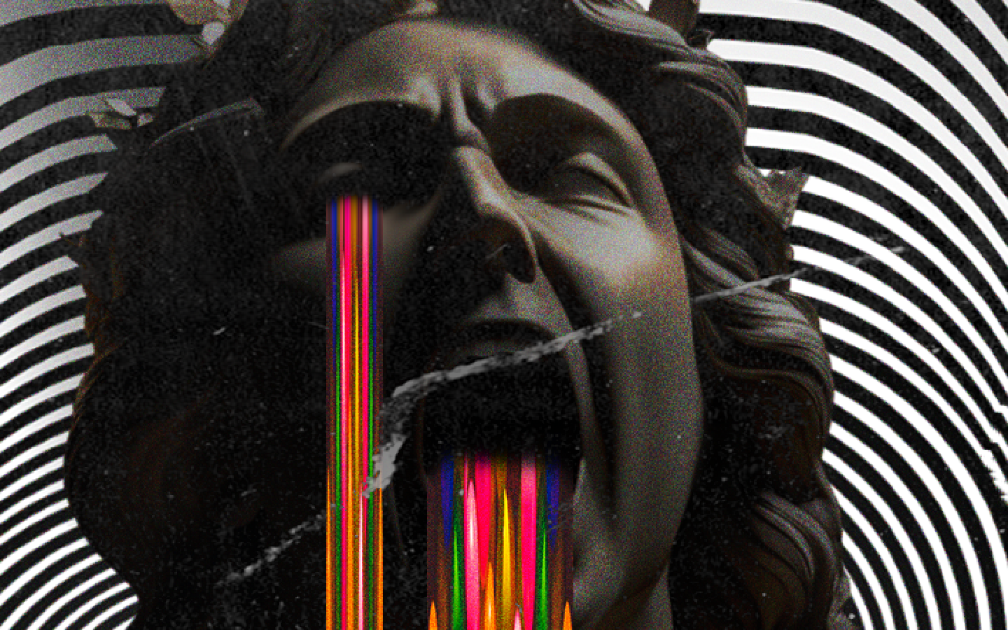
Starting from the previous practice, I used this statue and using the same colored image, I resized and reduced it to place it in the mouth and eye socket. This represents a cry of pain and also transitions into a psychedelic effect.
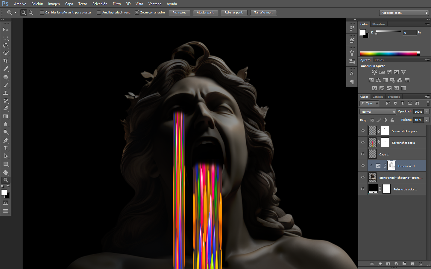
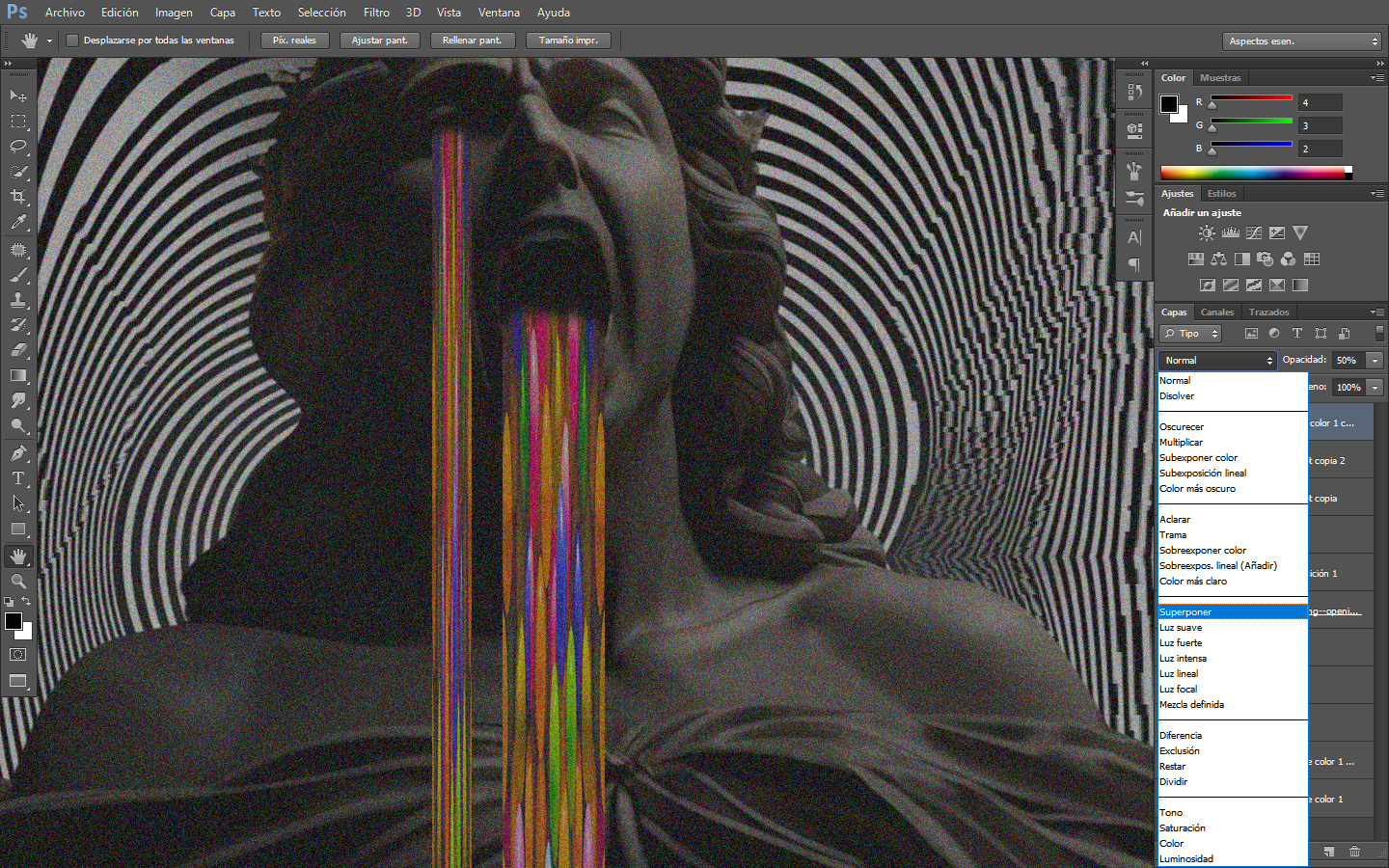
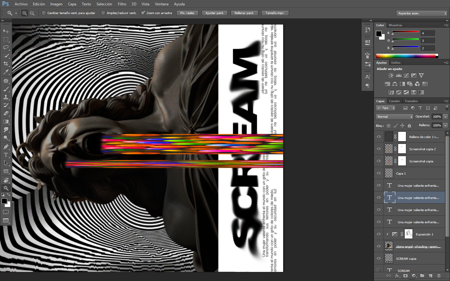
For the second part, I used an exposure layer to adjust shadows and highlights. Why? Because it allows the colors to stand out much more. Also, in each color drop, I used a layer mask to eliminate certain areas and blend them with the darkness.
Comenzando desde la práctica anterior, utilicé esta estatua y usando la misma imagen a color, la reduje y la ajusté para colocarla en la boca y en el ojo. Esto representa un llanto de dolor y también transita hacia un efecto psicodélico.
Para la segunda parte, utilicé una capa de exposición para ajustar sombras y luces. ¿Por qué? Porque permite que los colores destaquen mucho más. Además, en cada gota de color, usé una máscara de capa para eliminar ciertas áreas y fusionarlas con la oscuridad.
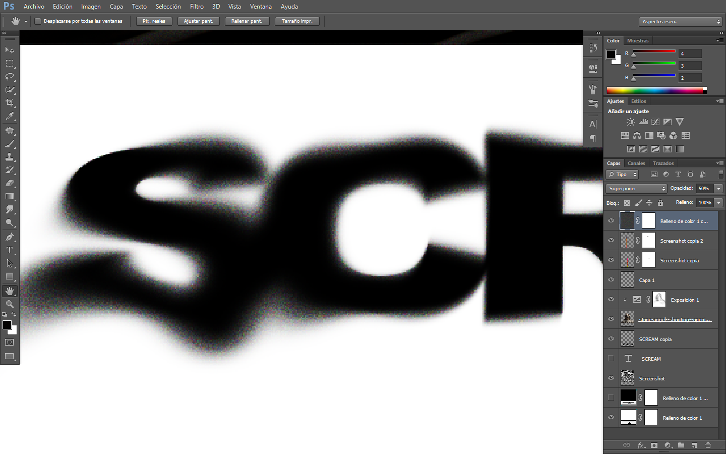
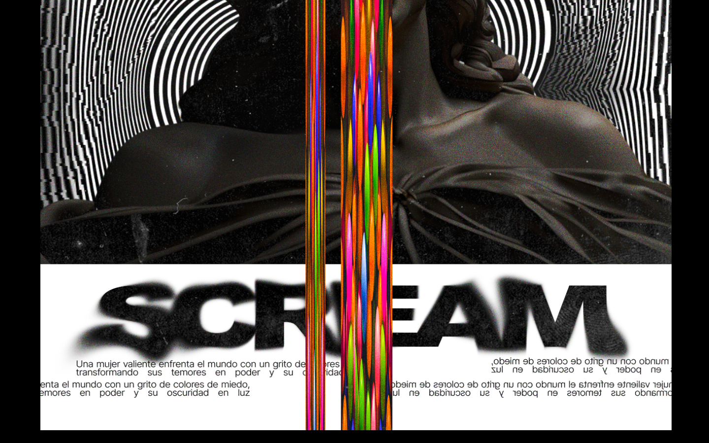
To separate the image and its title a bit, I made a rectangular cut and placed the text SCREAM there. Then, using the smudge tool, I moved it slightly before applying noise over the image. The noise is applied by creating a layer that covers the entire image in gray, reducing it to 50%, and using overlay mode to control the grayscale scale. This way, we achieve a better visual of the noise without affecting the overall image view.
Para separar un poco la imagen y su título, realicé un recorte rectangular y coloqué el texto SCREAM allí. Luego, usando la herramienta de dedo, lo moví ligeramente antes de aplicar ruido sobre la imagen. El ruido se aplica creando una capa que cubre toda la imagen en gris, reduciéndola al 50% y usando el modo de superposición para controlar la escala de grises. De esta manera, logramos una mejor visualización del ruido sin afectar la imagen en su totalidad.
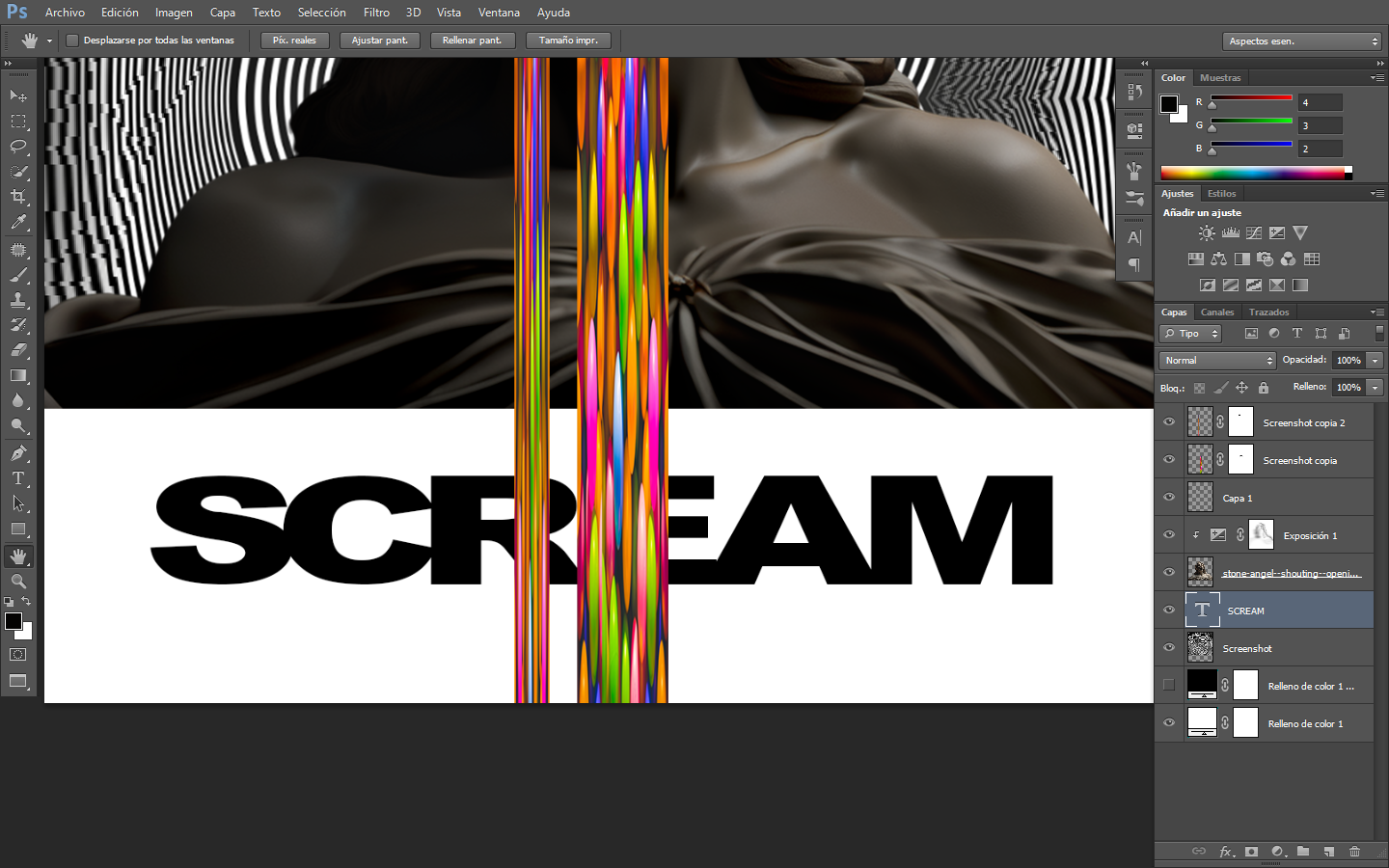
The title was crafted with details, and I decided to let the color rain fall over the title to give it depth and dynamism to the image. Finally, I used a texture of noise and dirt that would complete the design along with the details. The essential aspect is not the applicable mode but how layers can be used to present the image in a way that allows each detail to be appreciated.
El título se fue conformando con detalles, y decidí dejar caer la lluvia de colores sobre el título para darle un poco de profundidad y dinamismo a la imagen. Por último, utilicé una textura de ruido y suciedad que terminaría de conformar el diseño junto con los detalles. Lo esencial no es el modo aplicable, sino cómo se pueden utilizar las herramientas de capas para dejar la imagen de un modo que pueda apreciarse cada detalle.
Tools Used :
Photoshop
WACOM CTL 472
Font AI Style Cinematic