¡Muy buenas mis hivers artistas! Aquí les traigo una ilustración que llevo un plazo de ¡dos días de elaboración! Espero que sea de su agrado.
English Version
Good morning my hivers artists! Here I bring you an illustration that took two days to make! I hope it will be to your liking.
Y como era de esperarse por fin te traigo una ilustración con todo el toque y esfuerzo que se merece, en anteriores post había mencionado que estaba de reposo, pero ya volví a la lucha y estoy haciendo más ilustraciones que antes.
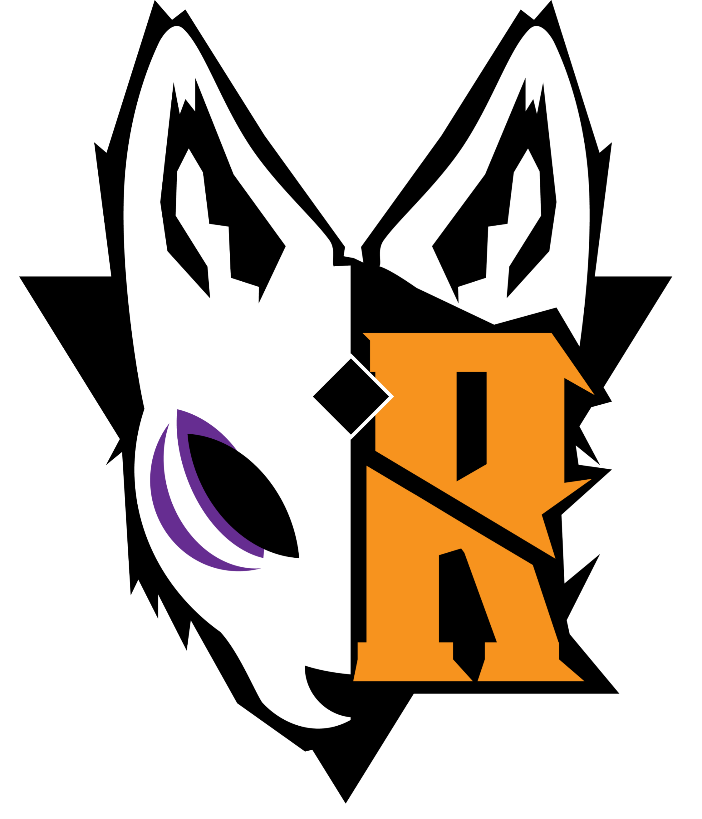
Y el día de hoy te traigo el paso a paso de la recreación de mi logo, quise darle vida en el personaje en el que fue inspirado que fue un zorro como tal
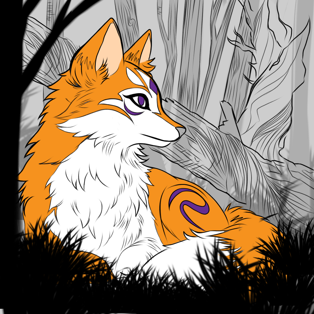
Ya como teníamos la vista previa de lo que queríamos, Ilustramos y empezamos con el boceto
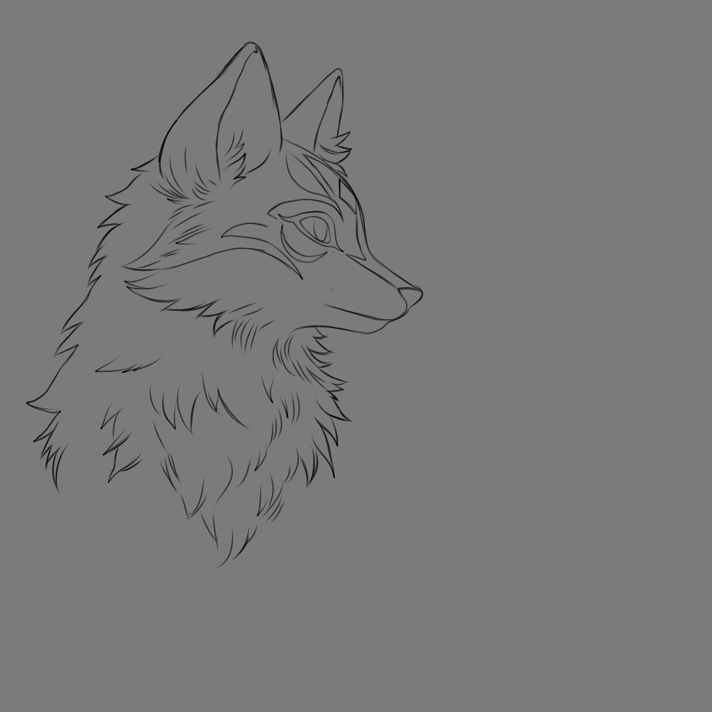
¡El fondo gris es lo máximo!
Para los que están empezando en este mundo de la ilustración, es recomendable utilizar un lienzo de color gris para no fatigar la vista y tener mejor percepción de las luces y sombras de tu dibujo.
nos Guiamos de los patrones de líneas que tiene mi logo y empezamos a darle ese toque de máscaras kitsune (que de ahí fue que salió la idea de mi logo amo las máscaras kitsune)
Teniendo la base de nuestro hermoso zorro, empezamos a darle forma a su cuerpo en una pose de descanso
Quería darle ese sentimiento de soledad, astucia y mucha paz, así que decidí darle esa emoción al zorro.
El Reto:
La idea principal que me llevo a hacer está ilustracion es por qué un seguidor me preguntó que si aceptaba el reto de ilustrar por cuatro días seguidos, y yo como soy amante de los retos ¡Acepte!,¡Jamás le digo que no a un verdadero reto!
El contexto del reto era que:
debe ser una ilustración original
si era algún persona de alguna sería tenía que ser a mi estilo
Y en menos de cuatro días
Y me dije a mi mismo:
¡Vamos Replicant que si se puede!,
¡Puedes con eso y muchisimo más!
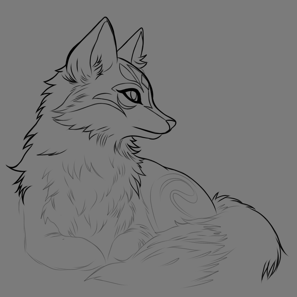
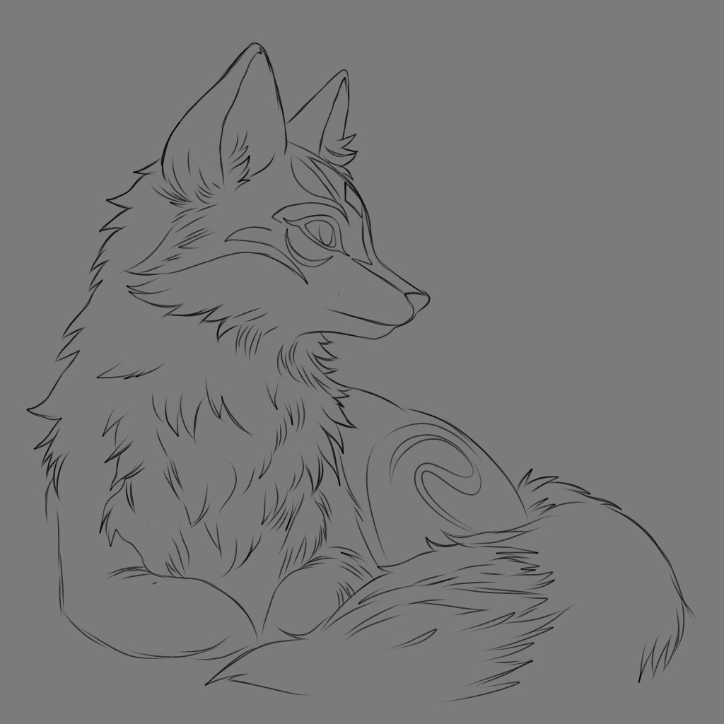
Luego de tener el boceto ya listo empezamos con el famoso Lineart
Sinceramente el fondo gris te da como que una inspiración, te da un plus para querer dibujar más ya que percibes las cosas de otra manera, utilice el pincel predeterminado de la Aplicación y le puse el estabilizador en el número 8
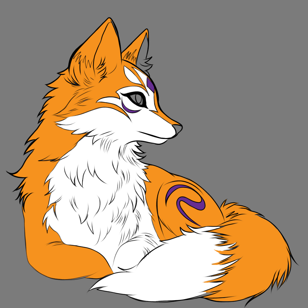
Luego del Lineart utilice el Gotero para copiar el color de La R que está en mi logo y así pintar cierta parte del Zorro, color que se ve muy bonito para la ilustración, el morado también lo saqué de la paleta de colores de mi logo.
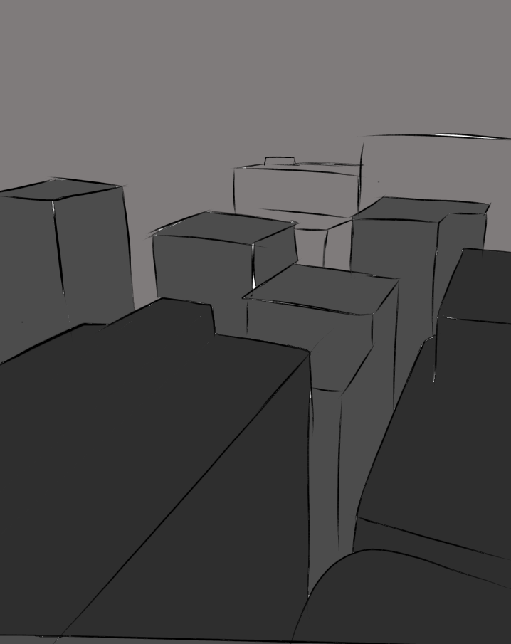
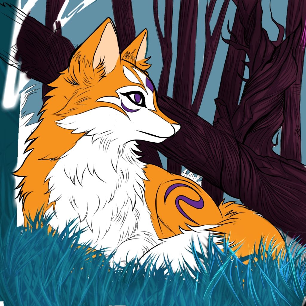
La clave para definir una buena ilustracion es: ¡Definir bien tu Background concept art!
Para los que no sepan el Background concept art es un método de ilustración que se emplea para hacer un fondo mejor y que no quede plano.
Aquí les va un pequeño ejemplo
Background Concept Art:
(Ilustracion humilde para explicar XD)
- En el Background concept art se divide en tres secciones
Frontground (parte Frontal)
Midelground (parte del medio)
Background (parte trasera de la ilustración)
Empezaremos a definir primero el
Frontground.

con un color totalmente Negro, para saber que ese es nuestro frente, para luego seguir con la parte del medio con un tono más opaco para definir la profundidad de nuestra ilustracion, y luego culminar con un tono gris más claro
para definir la lejanía y que se vea ese efecto 3D en nuestra ilustracion.
- ¡Y ya luego de las clases con el Tío Replicant volvemos a la ilustración!
Ya teniendo claro lo que debemos hacer con el fondo empezamos a marcar los detalles de los árboles y arbustos (lo que tengamos pensado ilustrar en mi caso fueron árboles y arbustos)
Después de hacer cada detalle empecé
A aplicarle color en máscaras de recortes y en una que otra capa nueva para que no se alterará el dibujo y no se volviera un ocho alrevez
¡La parte que mas me enamoró!
Sin duda alguna la parte de pintar la ilustración se a convertido en una de mis partes favoritas a la hora de ilustrar o dibujar, ¡y eso que hace mucho antes yo no sabía colorear nada!
Yo solo dibujaba a blanco y negro por qué se me hacía más fácil pero después que descubrí ese climax dónde puedo apreciar cada sombra, cada detalle y cada iluminación, siento que estoy creando a otro ser vivo ¡como si pudiera darle vida!
Es una sensación increíble, y también por qué está ilustracion me identifica muchísimo, lo hice a mi imagen de personalidad solo que adoptando la imagen de mi logo.
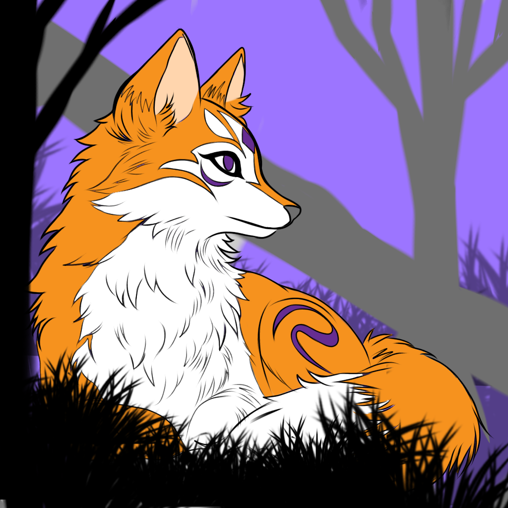
Teniendo ya la base de nuestro color empezamos con la recta final, iluminación y sentimientos en el lienzo, está parte fue todo un reto para mí ya que tuve que borrar muchas veces varias capas que no me gustaron
No me convenció el resultado del color y tuve que volver a empezar, no desde cero solo en temas de iluminación, jugar con la saturación, la opción de sobreexponer, mascara de recortes, distintos pinceles, iluminación suave o intensa.
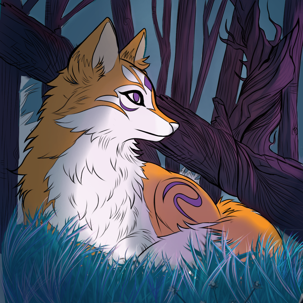
Hasta que encontré el resultado que quería en tema se iluminación ya que quería hacerlo en un fondo de noche con las paletas de colores azul, morado, verde y marrón.
que las luces fuesen algo lila, amo mucho el color morado entonces queria darle ese detalle.
¡llegamos al final! ¡Muchas gracias por ver mi ilustracion!
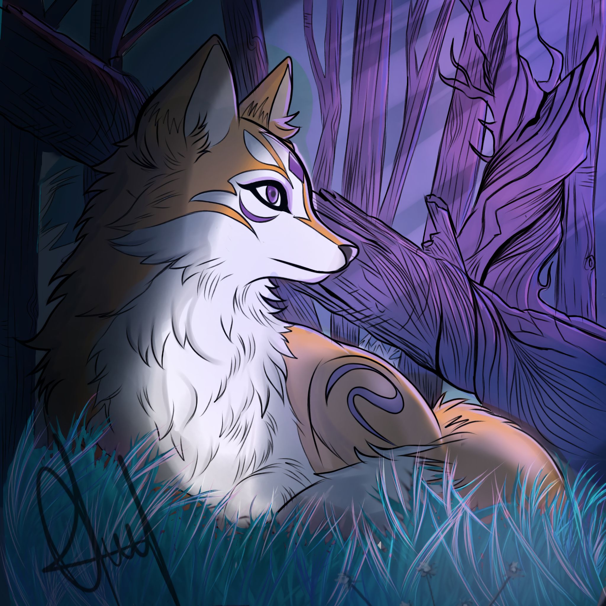
Ya culminado el post, aquí está el resultado final, un resultado que me cautivó y no paro de ver, no me canso de apreciar esta obra ya que como dije anteriormente me identifica muchísimo, logré lo que quería con la ilustración.
Gracias por leer mi post si te gusto déjame en los comentarios que te pareció y que parte te gustó
No olvides seguirme en mis redes si te gusta mi contenido, estaré dando tips de ilustración para principiantes para que se sumen más a esta plataforma muchísimos más Hivers Artistas
Te a hablado Tu a amigo , ilustrador y caster de confianza Replicant ¡y nos vemos en otra ocasión!
English Version
And as expected I finally bring you an illustration with all the touch and effort it deserves, in previous posts I had mentioned that I was resting, but I'm back to the fight and I'm doing more illustrations than before.
And today I bring you the step by step of the recreation of my logo, I wanted to give life to the character in which it was inspired by a fox as such.
Now that we had the preview of what we wanted to illustrate we started with the sketch
The gray background is the best!
For those who are just starting in this world of illustration, it is advisable to use a gray canvas to avoid eyestrain and to have a better perception of the lights and shadows of your drawing.
we were guided by the line patterns that my logo has and we started to give it that kitsune masks touch (that's where the idea of my logo came from, I love kitsune masks).
Having the base of our beautiful fox, we started to shape his body in a resting pose.
I wanted to give him that feeling of loneliness, cunning and a lot of peace, so I decided to give that emotion to the fox.
The Challenge:
The main idea that led me to do this illustration is because a follower asked me if I would accept the challenge to illustrate for four days in a row, and I as I am a lover of challenges I accepted, I never say no to a real challenge!
The context of the challenge was that:
it must be an original illustration
if it was someone from someone else, it had to be in my style.
And in less than four days
And I said to myself:
Come on Replicant, you can do it,
You can do it and much more!
After having the sketch ready we start with the famous Lineart
Sincerely the gray background gives you like that an inspiration, it gives you a plus to want to draw more since you perceive the things in another way, I used the default brush of the Application and I put the stabilizer in the number 8
After the Lineart I used the Eyedropper to copy the color of The R that is in my logo and thus paint a certain part of the Zorro, color that looks very nice for the illustration, the purple I also took it from the color palette of my logo.
The key to define a good illustration is: Define well your Background concept art!
For those who don't know Background concept art is an illustration method used to make a background better and not flat.
Here is a small example
Background Concept Art:
(Humble Illustration to explain XD)
- The Background concept art is divided in three sections
Frontground (Front part)
Midelground (middle part)
Background (back part of the illustration)
We will start defining the
Frontground.

with a totally black color, to know that this is our front, and then continue with the middle part with a more opaque tone to define the depth of our illustration, and then culminate with a lighter gray tone to define the distance and the 3D effect in our illustration.
to define the distance and to show the 3D effect in our illustration.
- And after the lessons with Uncle Replicant we are back to the illustration!
Already having clear what we must do with the background we begin to mark the details of the trees and bushes (what we have thought to illustrate in my case were trees and bushes).
After making each detail I started
To apply color in clipping masks and in one or another new layer so that the drawing was not altered and did not turn into an upside down eight.
The part I loved the most!
Without a doubt the part of painting the illustration has become one of my favorite parts when illustrating or drawing, and that's because long ago I didn't know how to color anything!
I only used to draw in black and white because it was easier for me but after I discovered that climax where I can appreciate every shadow, every detail and every illumination, I feel like I am creating another living being, as if I could give it life!
It's an incredible sensation, and also because this illustration identifies me a lot, I did it in my personality image only adopting the image of my logo.
Having already the base of our color we started with the final stretch, lighting and feelings on the canvas, this part was a challenge for me because I had to erase many times several layers that I did not like.
I was not convinced by the result of the color and I had to start again, not from scratch only in lighting issues, playing with saturation, overexposure option, clipping mask, different brushes, soft or intense illumination.
Until I found the result I wanted in terms of lighting as I wanted to do it on a night background with the color palettes blue, purple, green and brown.
I wanted the lights to be a little lilac, I love the color purple so I wanted to give it that detail.
####, we've reached the end! Thank you so much for seeing my illustration!
Now that the post is finished, here is the final result, a result that captivated me and I can't stop looking at it, I never get tired of appreciating this work because as I said before I identify myself very much, I achieved what I wanted with the illustration.
Thank you for reading my post if you like it leave me in the comments what you thought and what part you liked.
Don't forget to follow me on my networks if you like my content, I will be giving illustration tips for beginners so that many more Hivers Artists join this platform.
Your friend, illustrator and trusted caster Replicant has spoken to you and I'll see you another time!
follow me on my social networks!
¡sígueme en mis redes sociales!