Hola, personas de Hive.
Hello Hive people.
Hoy vengo con otro interesante y divertido dibujo que compartirles. Siendo que en este mismo momento me encuentro aburrido, pasa que encuentro en Pinterest una serie de imagenes muy carismaticas y chistosas de personas vestidas de soldados, todas con chapitas con cosas de anime en sus uniformes, y en alguna parte de sus uniformes (Normalmente el casco) las siglas: "NEET" que en ingles vendria a significar algo asi como: "Not in Employment, Education or Training" o "ni trabaja, ni estudia ni recibe formación". Y es alli cuando descubri el fenomeno de la NEET Army, que son personas que se disfrazan de soldados NEET generando asi un divertido contraste entre seriedad y "goofiness."
Today I come with another interesting and fun drawing to share with you. Being that at this very moment I am bored, it happens that I find on Pinterest a series of very charismatic and funny images of people dressed as soldiers, all with badges with anime things on their uniforms, and in some part of their uniforms (Normally the helmet) the acronym: "NEET" which in English would mean something like: "Not in Employment, Education or Training" or "neither works, nor studies nor receives training." And that's when he discovered the phenomenon of the NEET Army, which are people who dress up as NEET soldiers, thus generating a fun contrast between seriousness and "goofiness."

(I know the translation doesn't make sense :P)
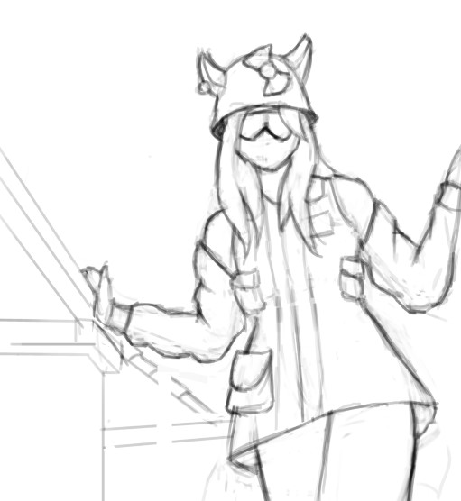
Asi que empezamos, y tenemos el boceto. Las lineas mas gruesas sirven para enfatizar a donde se quiere llamar la atencion, diferenciandose asi de las lineas mas opacas que son los elementos secundarios de esta pieza -el fondo.-
Es una decision de composicion, esencialmente. Aunque tambien tiene su lado estetico.
So we start, and we have the sketch. The thicker lines serve to emphasize where you want to draw attention, thus differentiating themselves from the more opaque lines that are the secondary elements of this piece - the background.

It's a composition decision, essentially. Although it also has its aesthetic side.
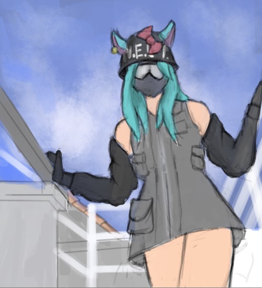
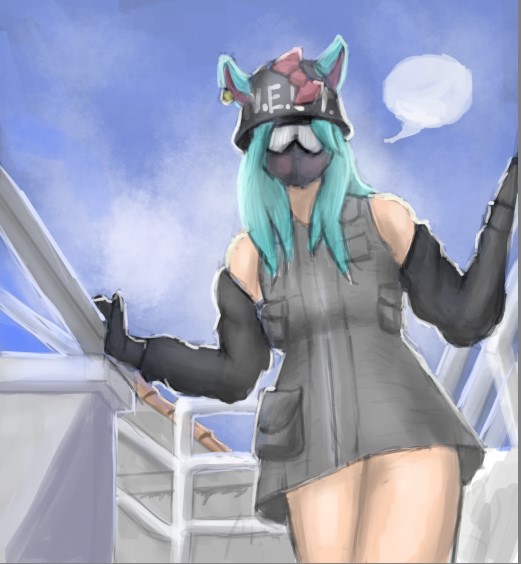
Ahora, como es normal, se añaden los colores base.
Now, as normal, the base colors are added.
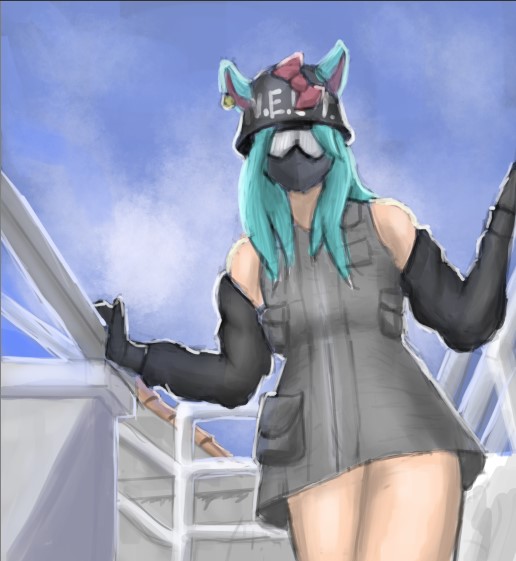
Y se que esta parte podria meterme en problemas por todos los cambios abruptos que ocurrieron entre esta imagen y la otra, pero de todas formas explicamos cada una de las cosas que ocurrieron entre una y otra.
Primero añadi las sombras, y mediante ellas reforcé un poco la silueta de tela presente ya desde el lineart.
Después añadí la luz, la cual en su mayoría viene de una brocha ligera y es en forma de gradiente, y si se fijan (Aunque realmente es muy obvio) ahora el lineart es blanco. Pienso que se puede confundir con que el lineart ahora es simplemente en blanco, o es una forma de luz (O ambas) Y la verdad es que la intención es que esto es luz, aunque realmente pienso que sea como sea que se interprete, queda bien.
Y bueno, perdonen al I73v2 que pinto todo en una capa. :/
And I know this part could get me in trouble because of all the abrupt changes that occurred between this image and the other, but anyway we explained each of the things that happened between one and the other.

First I added the shadows, and through them I slightly reinforced the fabric silhouette already present from the lineart.

Then I added the light, which mostly comes from a light brush and is in the form of a gradient, and if you notice (Although it is really very obvious) now the lineart is white. I think it can be confused with the lineart now being simply blank, or it being a form of light (Or both) And the truth is that the intention is that this is light, although I really think that however it is interpreted, it remains good.

And well, forgive I73v2 for painting everything in one layer. :/
Después mas gradientes de luz, y la base de un globo de texto que pienso es un detalle que podría ser carismático.
Then more light gradients, and the base of a text balloon that I think is a detail that could be charismatic.
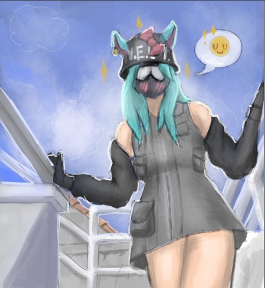
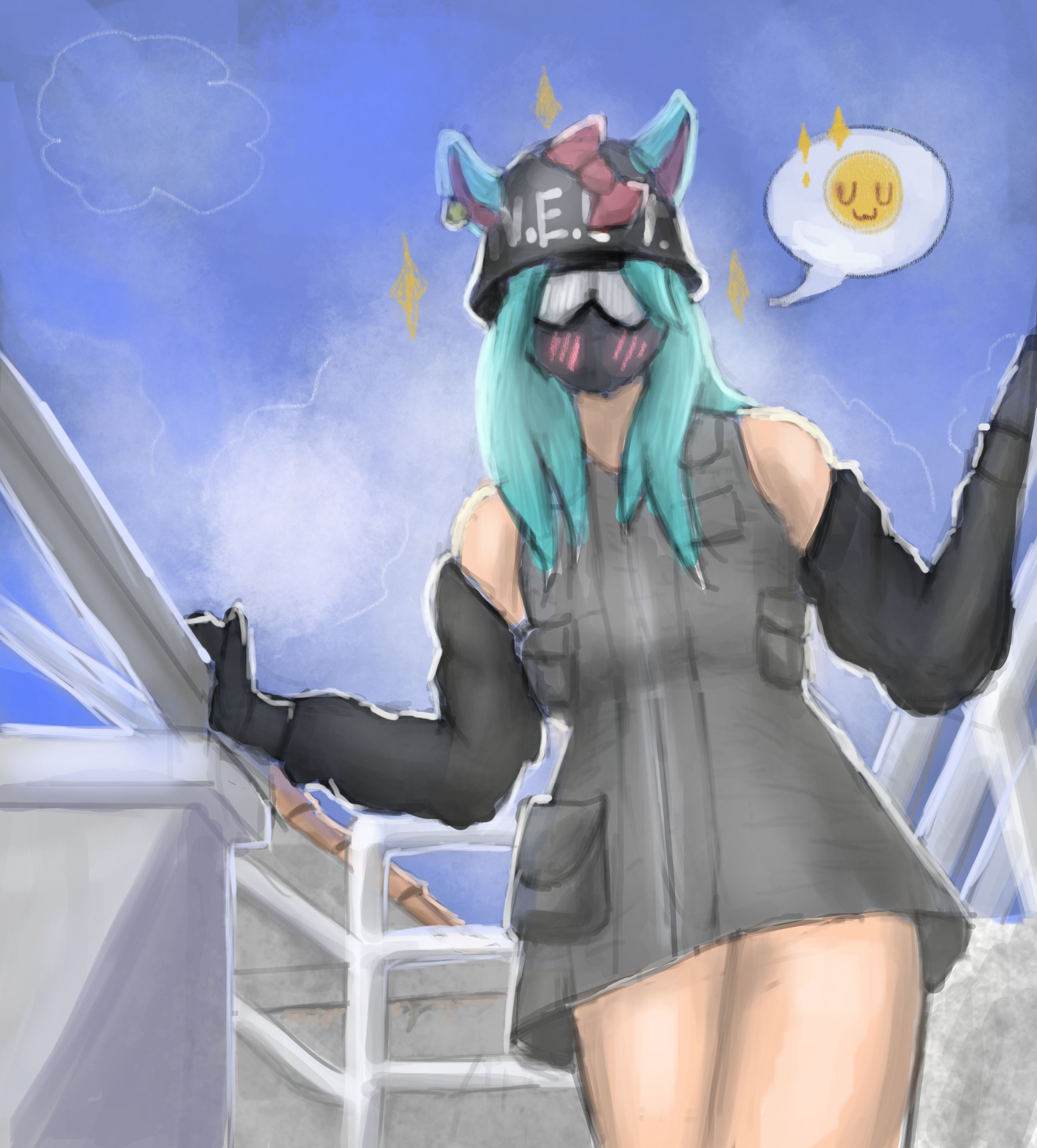
Y por fin tenemos la pieza final. Y lo que se hizo aqui fue añadir el detalle del globo de texto con el "UwU" y los trazos de lapiz tradicional atraves de las nubes. Un dibujo muy carismatico, no se que piensen ustedes. Todo fue realizado en Krita.
Muchas gracias por leer, hasta pronto!
And finally we have the final piece. And what was done here was to add the detail of the text balloon with the "UwU" and the traditional pencil strokes through the clouds. A very charismatic drawing, I don't know what you think. Everything was done in Krita.

Thank you very much for reading, see you soon!