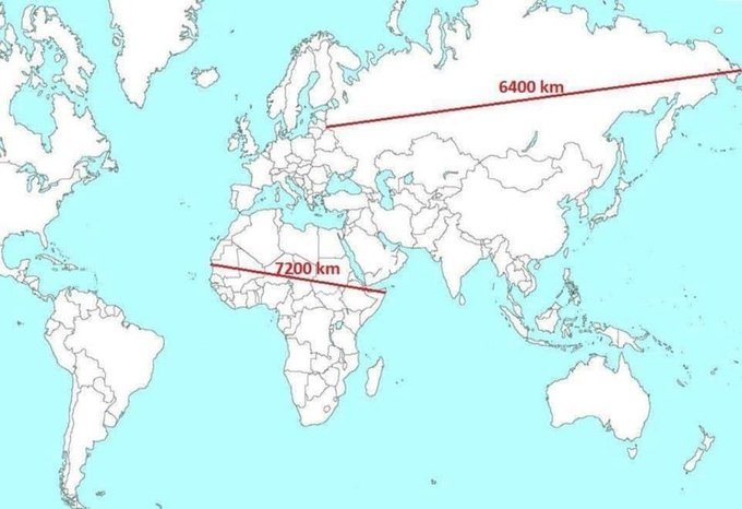
Afrika ist viel größer als die Meisten denken. Das Problem ist die Projektion der Oberfläche der dreidimensionalen Erde auf eine 2D-Landkarte.
Die vorherrschende Projektion ist eine einfache Zylinderprojektion, die ins 16. Jahrhundert zurückgeht und nach dem Katografen Gerardus Mercator bennant ist, der unter anderem diese Projektion verwendet hat.
Vorteil der Mercator-Projektion ist, dass die Form der Kontinente und – wichtig für die Seefahrt – Winkel erhalten blieben, aber es gibt eine Verzerrung in Richtung Nord- und Südpol. Je weiter man vom Äquator weg geht, desto größer wird alles dargestellt, sowohl in der x- als auch in der y-Koordinate.
Konsequenz ist, dass Afrika im Verhältnis zu Nordamerika, Europa und Nordasien viel kleiner dargestellt wird, als es tatsächlich ist.
Im Internetzeitalter könnte man dahinter sogar eine Verschwöhrungtheorie vermuten 😂 Die Marcator-Projektion begünstige die USA und Europa, da der globale Norden größer dargestellt wird. US-Zentrismus.
Was sagt ihr dazu? Denkt ihr, dass Afrika unterschätzt wird?
Mercator Projection
https://twitter.com/Rainmaker1973/status/1785699411814686932
True size of Africa
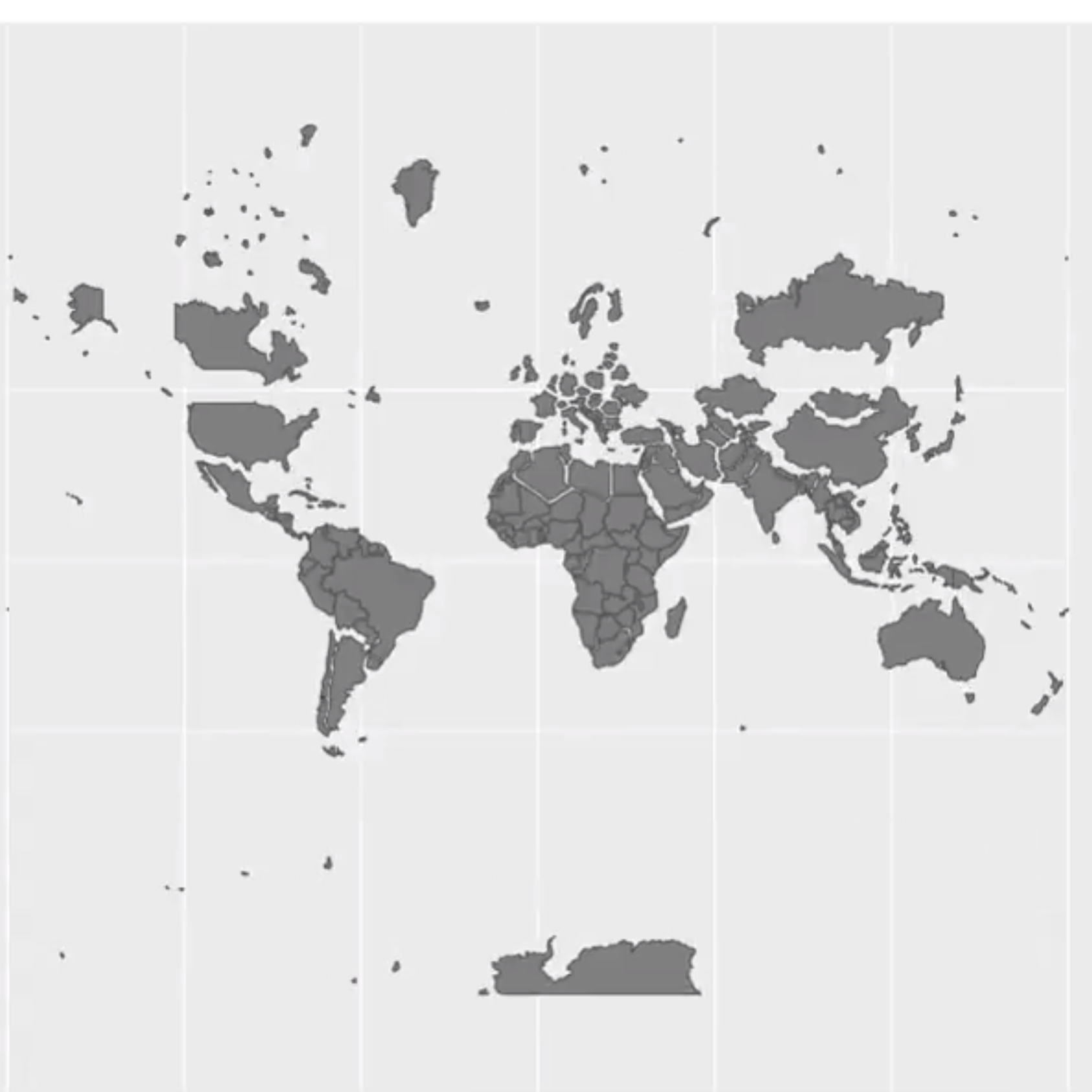
https://twitter.com/Civixplorer/status/1785699906537050391
US vs Africa
https://twitter.com/grandcasino_al/status/1785951964083159549
English
Africa is much bigger than most people think. The problem is the projection of the surface of the three-dimensional Earth onto a 2D map.
The predominant projection is a simple cylindrical projection, which dates back to the 16th century and is named after the catographer Gerardus Mercator, who used this projection, among others.
The advantage of the Mercator projection is that the shape of the continents and - important for seafaring - angles are retained, but there is a distortion in the direction of the North and South Poles. The further away from the equator you go, the larger everything is shown, both in the x and y coordinates.
As a result, Africa is shown much smaller than it actually is in relation to North America, Europe and North Asia.
In the internet age, one could even suspect a conspiracy theory behind this 😂 The Marcator projection favors the USA and Europe, as the global North is depicted larger. US centrism.
What do you think? Do you think Africa is being underestimated?
Live your Secrets and Hive Prosper 🍯
xx Viki @vikisecrets
Posted using STEMGeeks