It’s been a while since I devoted some time & energy into one of my passions, which is the amazing and wonderful world of Original Comic Book Art. I’ve discussed it here in drips & drabs for the past several years as I’ve showcased new pieces being added to the collection or covered the process of choosing a frame job that compliments said pieces. But today, I think I’m going to just share with you all, a few pieces that are finally getting the respect they deserve as they get hung for all to gawk at in my gallery.
Before we hop in, I’ll give any first timers around these parts, a crash course in what the hell I am even talking about. When I refer to Original Comic Art, I am talking about the actual original pencils & inks that are used to create that particular page or cover. With these Originals you’ll see today, the artist works with pencils on Bristol board which is the standard for most of these. I often prefer Inks over Pencils which simply means the inker goes over the original pencils and helps to define and refine the piece a bit more. Some artists will do the pencils and then scan them in to have the inker ink over a printed out version. Some artists work digitally and the inker will printout what is referred to as Bluelines and simply ink over that. I stay clear from all of that nonsense. I’m a straight meat & taters guy when it comes to my art. Originals all the way.
The next thing you might notice is that everything here revolves around the world of Spider-Man. That’s because he is and has always been my dude…that and I had to set some form of rules to abide by as it’s very easy to get carried away in this hobby. The world of Spidey gives me a big enough sandbox to play in while applying some very real self inflicted guidelines that I need to adhere to.
This hobby is highly competitive as these pieces are all one of a kind…especially when dabbling in the likes of Spidey & friends. Some of these guys in the space have extremely deep pockets & connections, making acquiring with certain specifics in mind…a challenge to say the least.
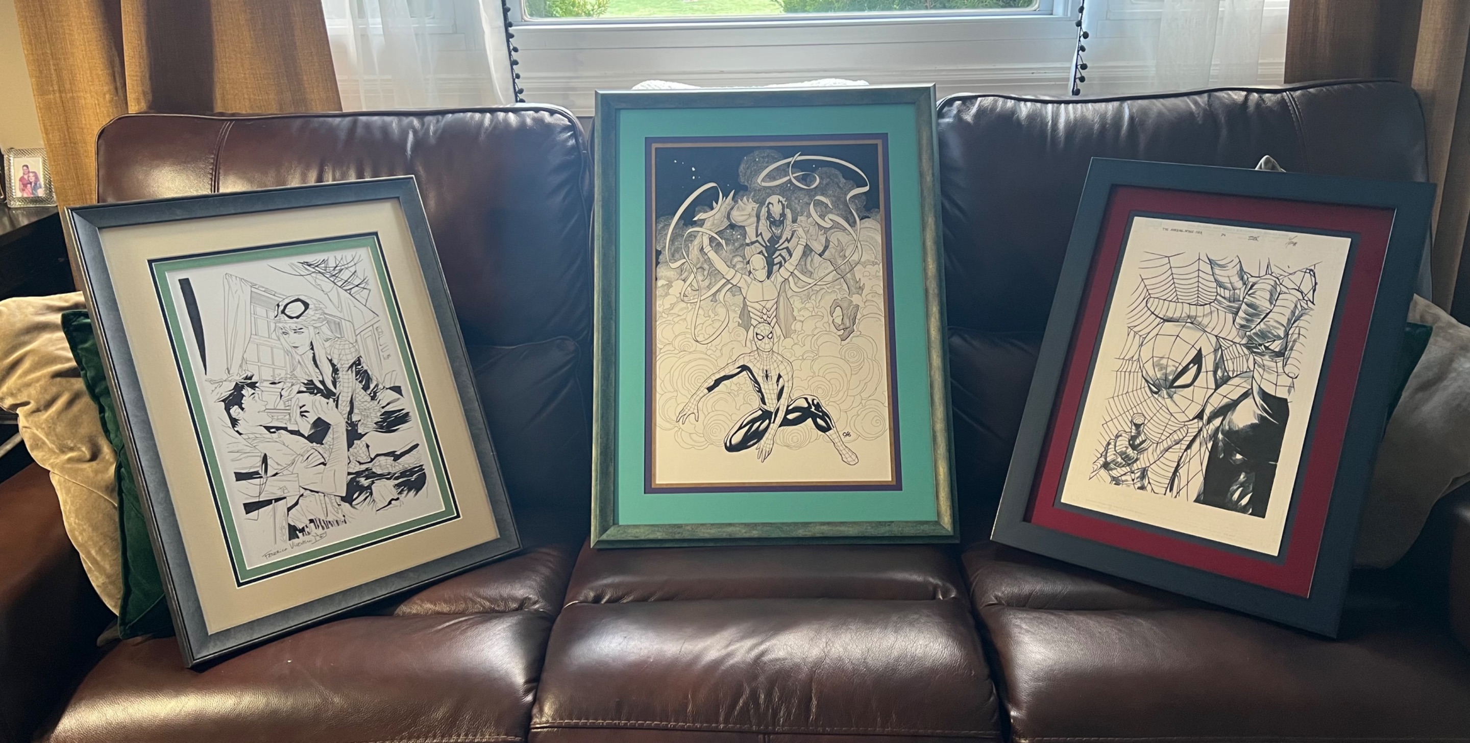
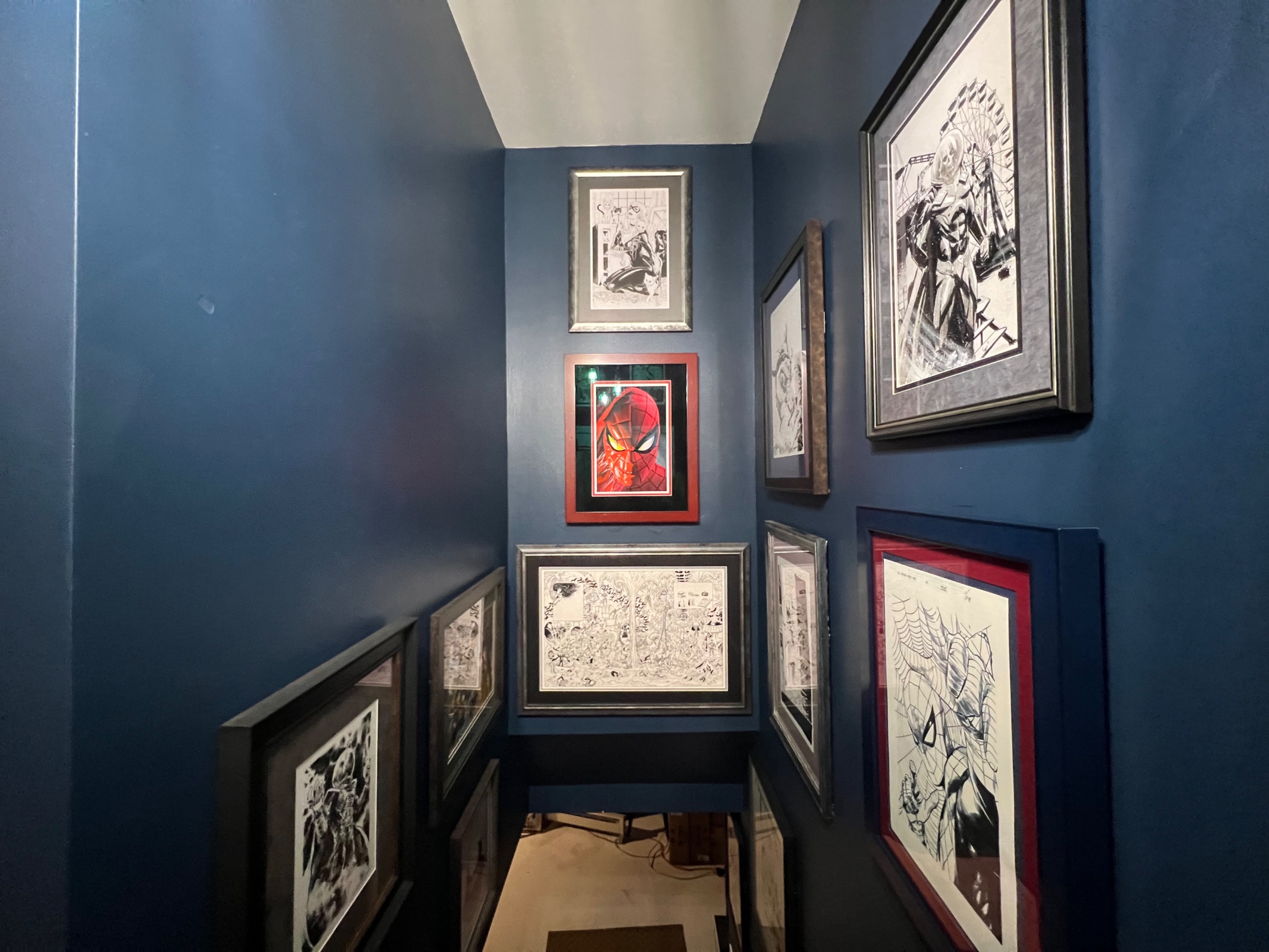
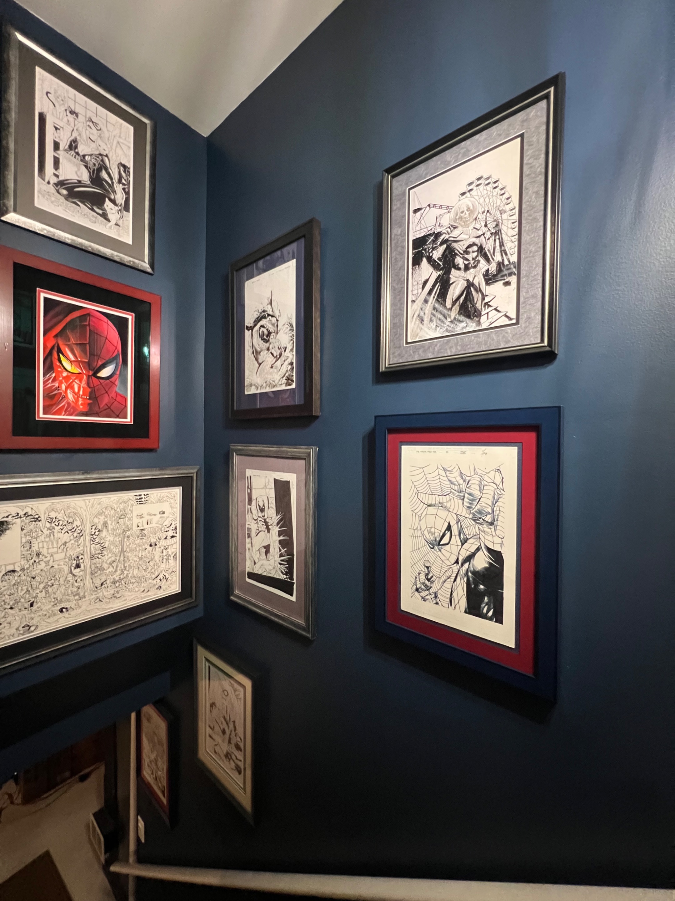
The 3 pieces that were hung today in my ever growing gallery were actually framed up over a year ago. Life has just been a tad busy, and we haven’t made the time to get these up until today when the wife & I decided to finally check something off the TO DO list. These 3 will be residing with the rest of the framed up beauties in the main hallway leading to the basement. You can see them off the kitchen or coming in from the backyard, and in the rare instances these days where we have other humans over, they always catch the eyes of our guests which sparks great conversation. Ok, let’s hop right in…
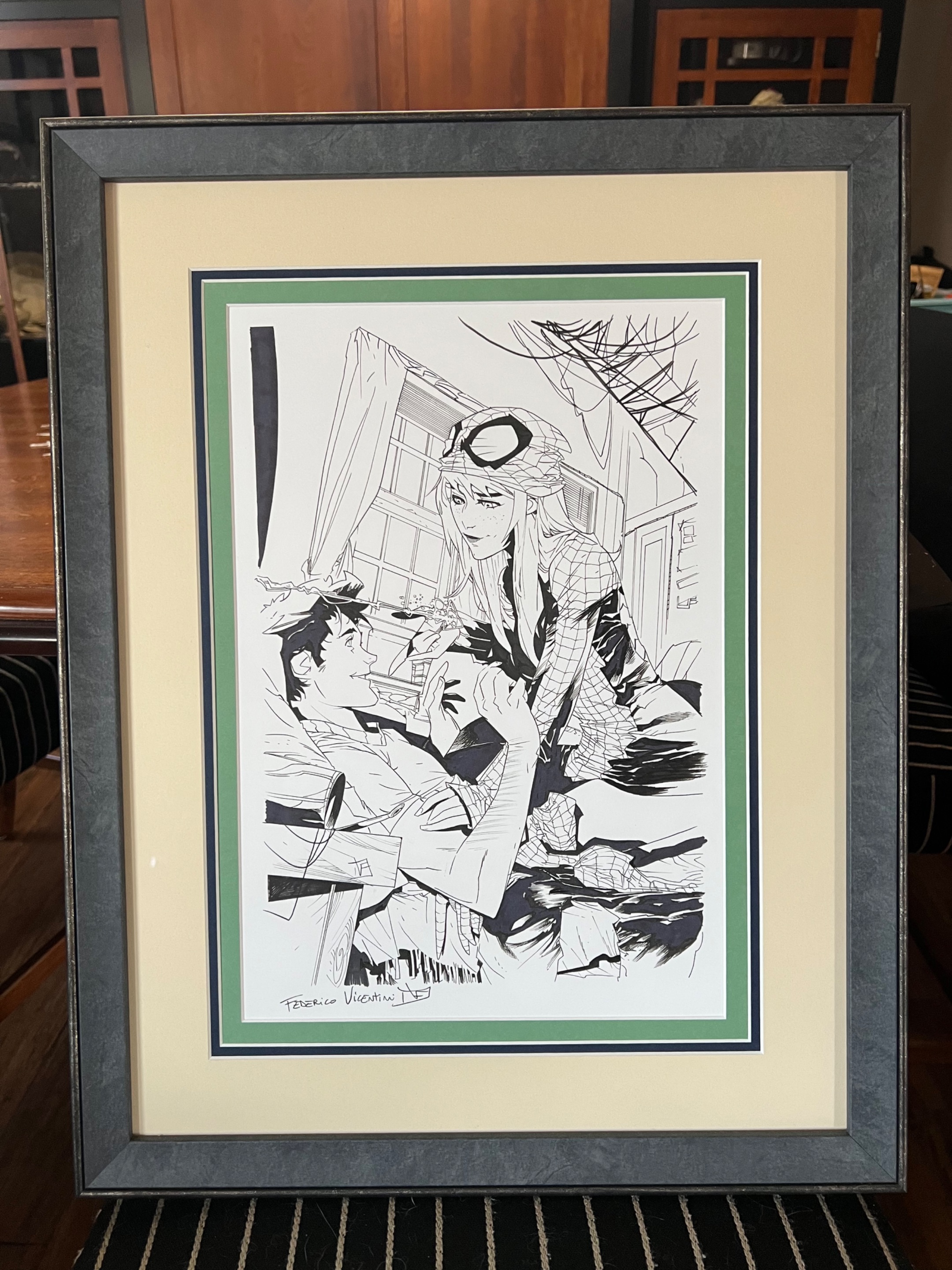
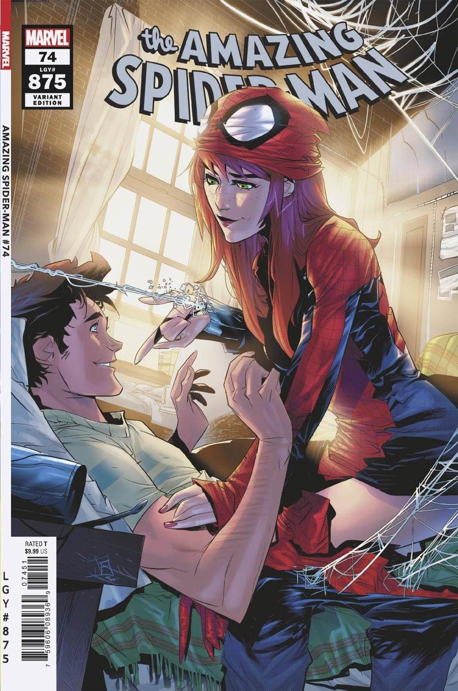
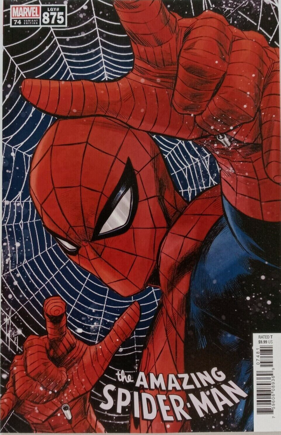
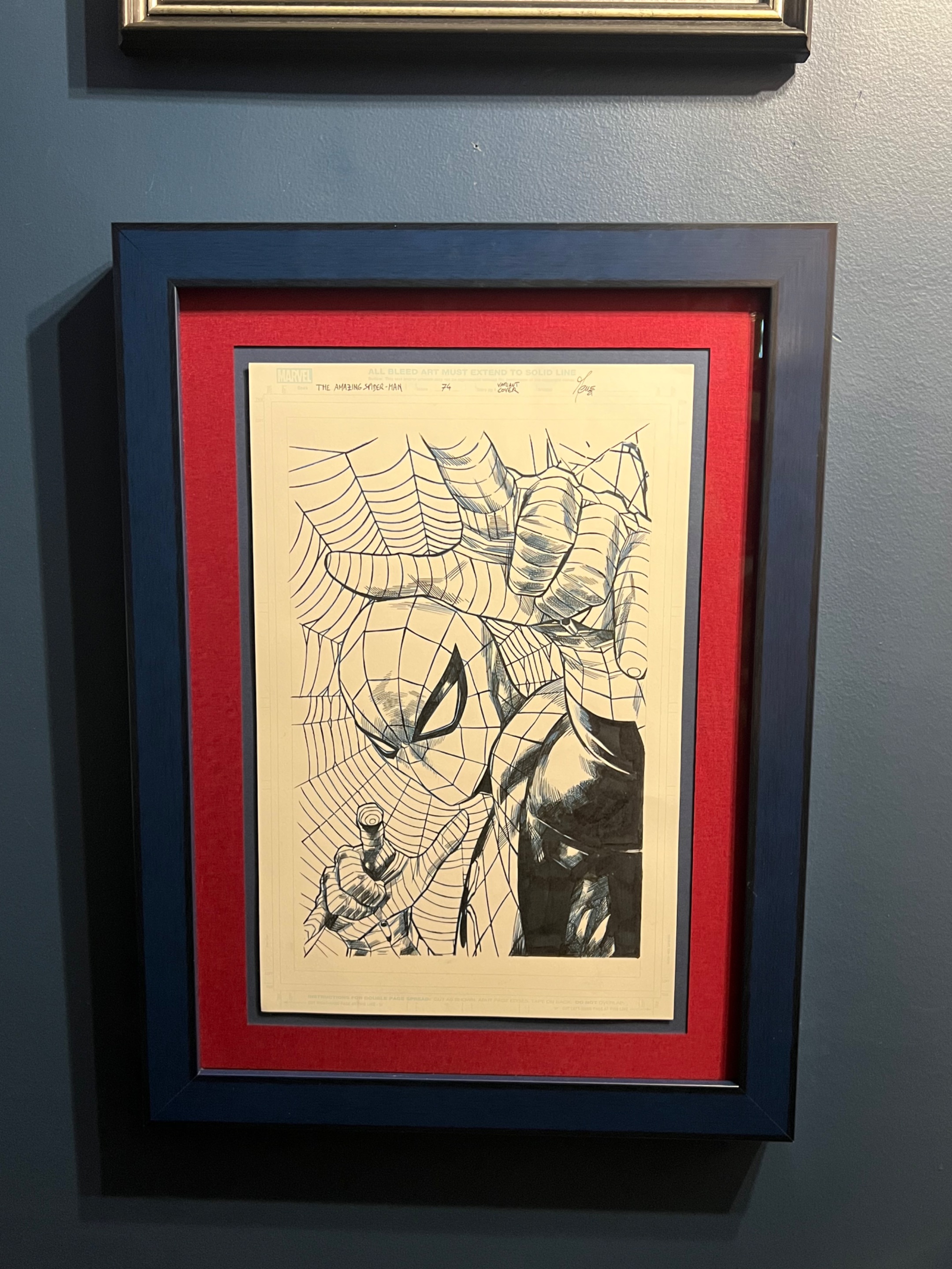
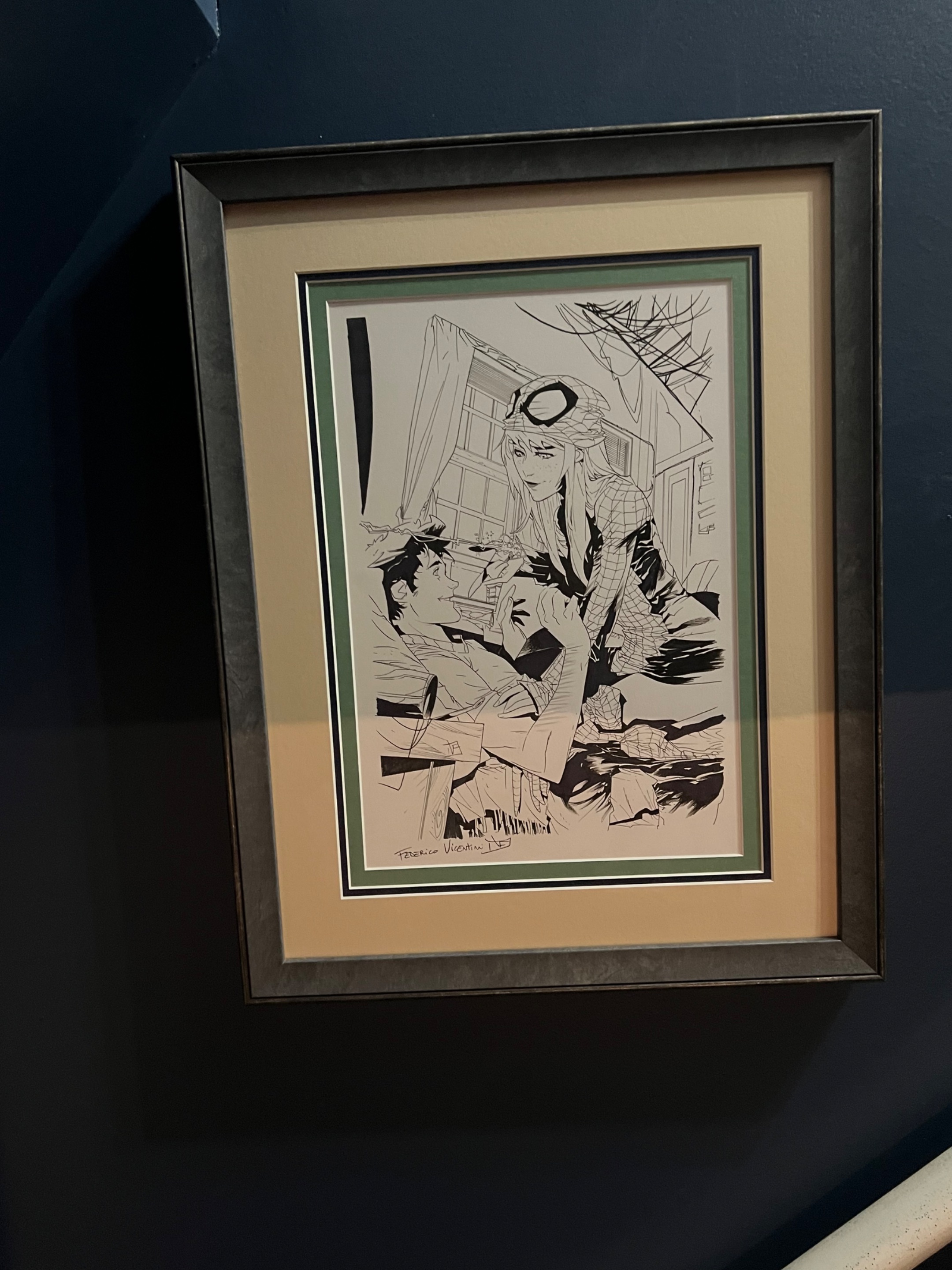
First up is a very playful piece by up & comer Federico Vicentini. It’s one of the variant covers for issue #74 (or #875 if going by Legacy numbering) on Amazing Spider-Man. I scored this piece alongside 2 other ASM covers that he did a few years back, directly from him for a complete steal. He quoted a price for the 3 that I’ll never ever see again when buying covers from the most coveted title in comics. I count myself as extremely lucky to snag these as we made this deal prior to him not only getting proper representation in the comic art circles, but also before his price shot up by thousands. Score!!!
The published piece is a vibrant and colorful shot of Peter & Mary Jane sharing a fun moment together while she dons the duds. I loved the sun shining through the windows, and I’ll often try to capture something from the published piece when framing it up. In this case, the bright matte represents that nourishing sunlight while the green is just a taste of color from the blanket & Peter’s shirt. The thin blue matte is a perfect match to the dark blue in the Spidey costume. The frame itself has the color of brick which can be seen as the main wall in their room. This badboy now will be seen crystal clear as you make your way down to the basement.
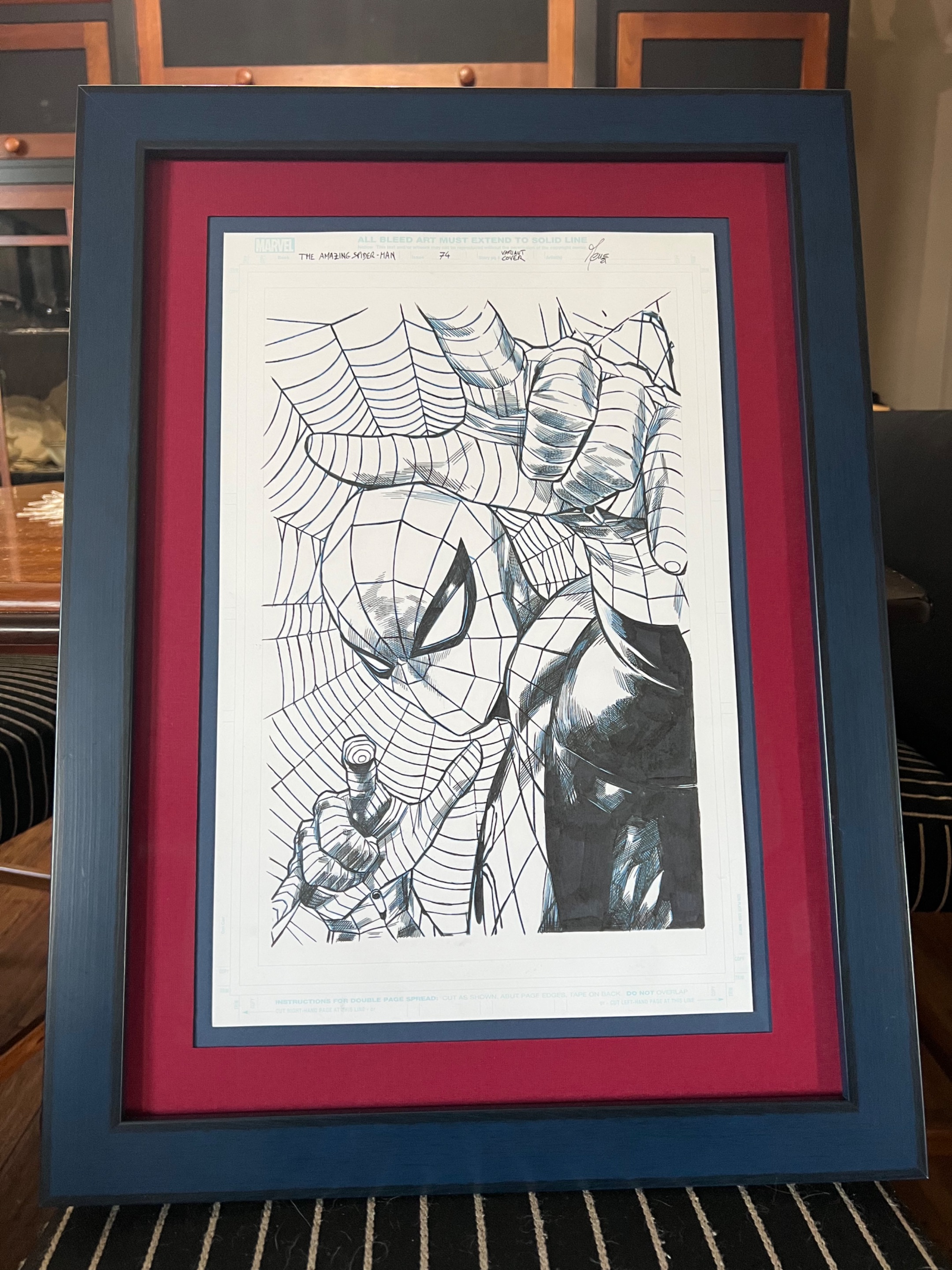
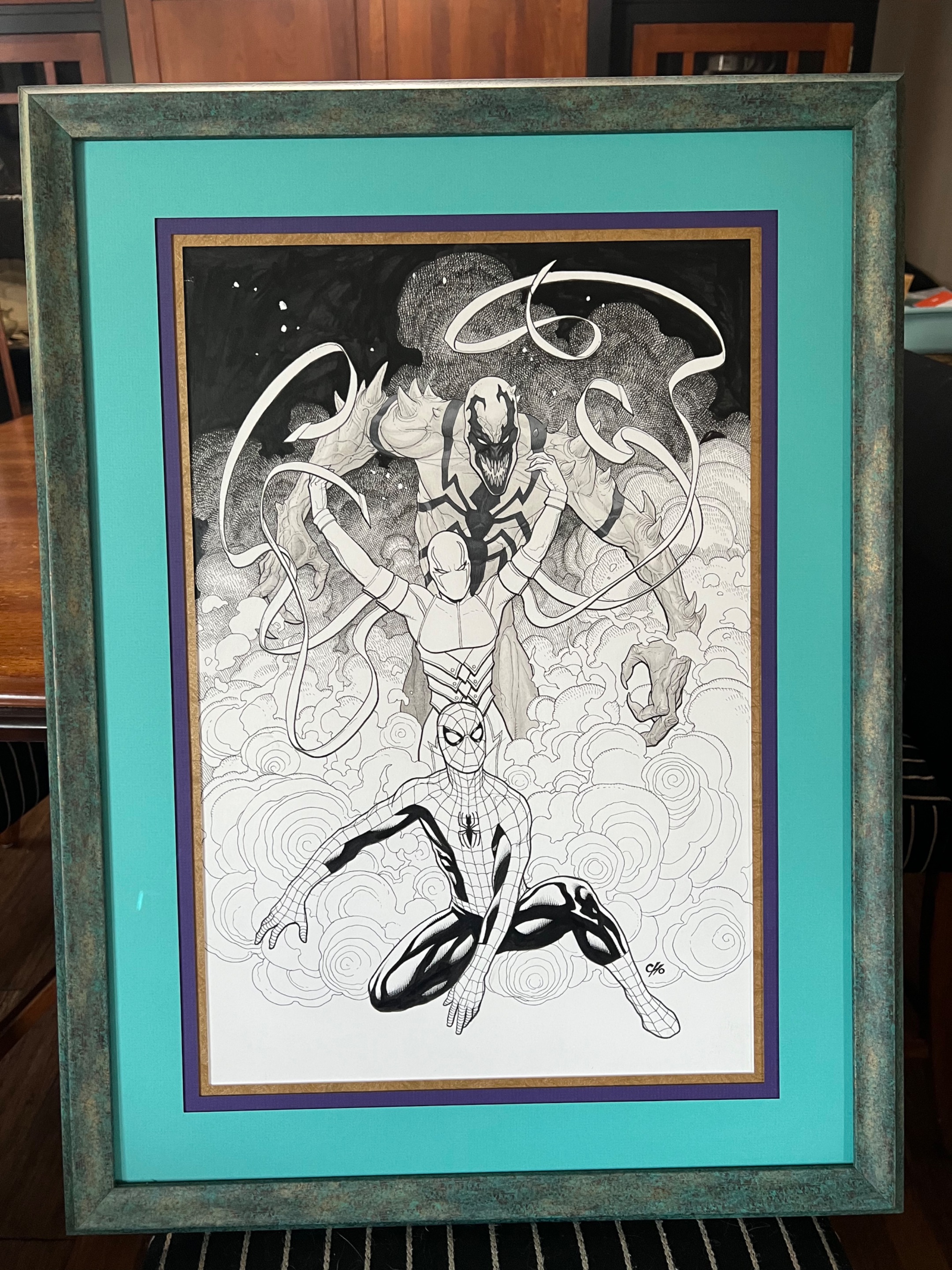
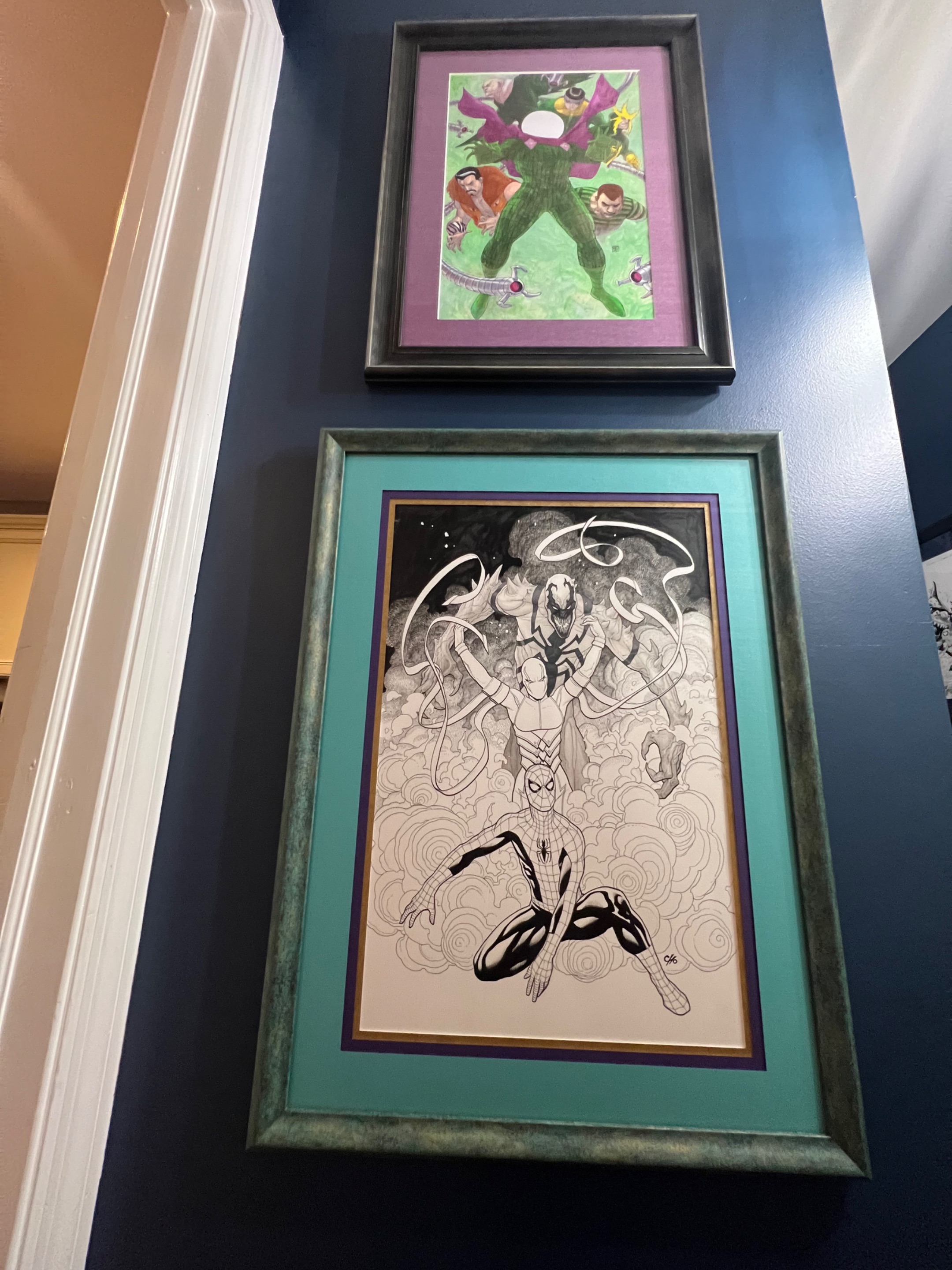
Next up is weirdly enough for the exact same issue. It’s another variant cover for ASM #74 (#875 Legacy). The artist…the amazing Marco Checchetto. Cool story here…when I got this piece framed up, I popped up a post here which I then shared with Marco on X. Not only is this shot of Spidey his avatar on X, but he told me that this was his favorite cover he’d ever done, & for a guy with his body of work…that is an amazing thing to hear.
For this frame up, simple works better I feel. There’s basically 4 “colors” in the published version being red, blue, black, and white. So I decided to stick with what worked in the colored piece which led me to blue & red mattes with a blue frame. The frame is a twin to one I did years earlier on another piece…just blue this time instead of a cherry red. This piece is stunning in person and now is front and center what you notice first when coming in from the kitchen.
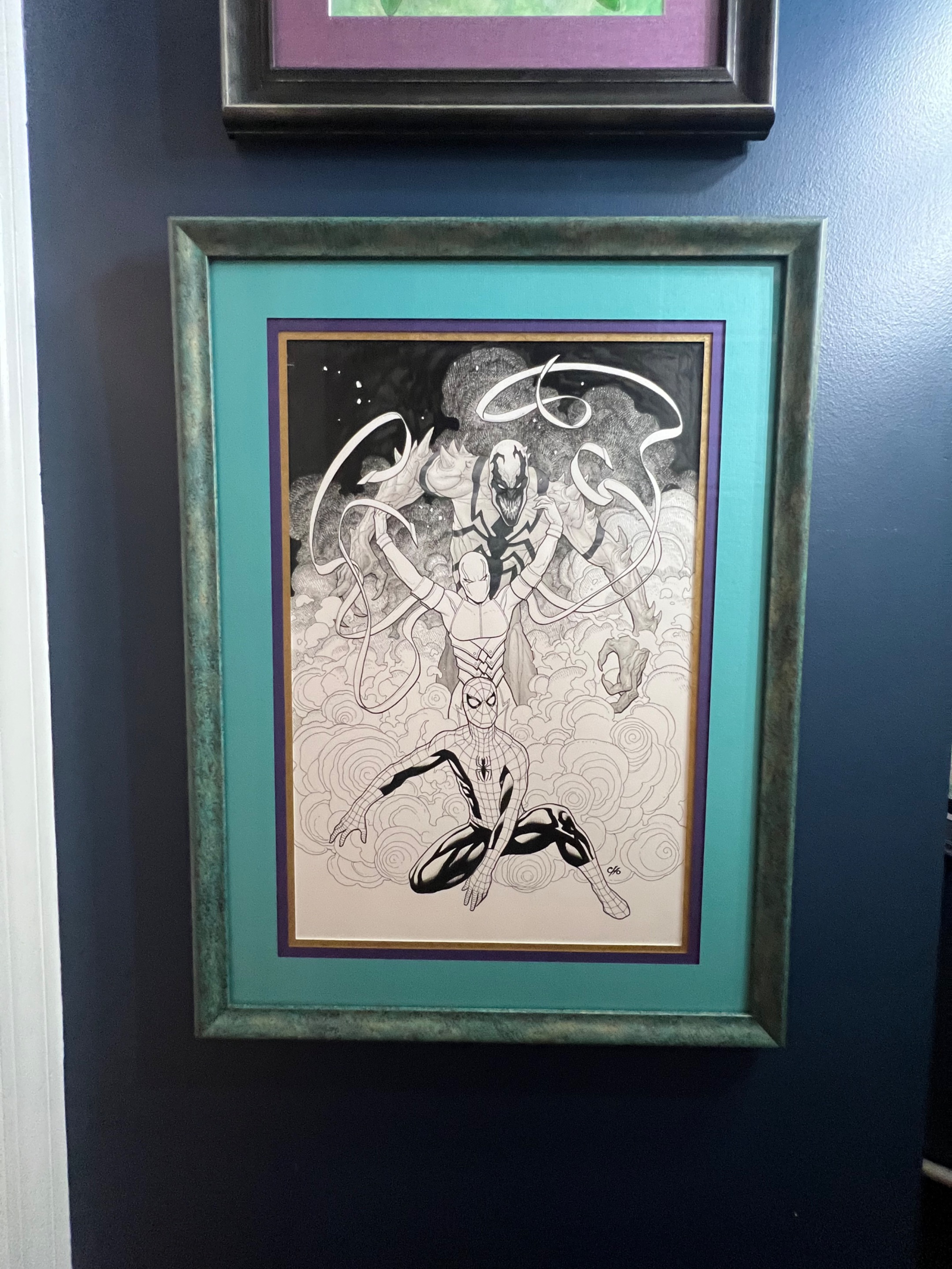
Lastly for today is another cover from…yup…you guessed it…The Amazing Spider-Man. This was from issue #663 and was dreamed up by Modern Master, Frank Cho. It features Spidey, Wraith, and Anti-Venom surrounded by a whirlwind of smoke. The published cover has a bunch of pretty colors throughout that I don’t usually have access to when choosing the frame job, so I took advantage of the opportunity and got a little weird.
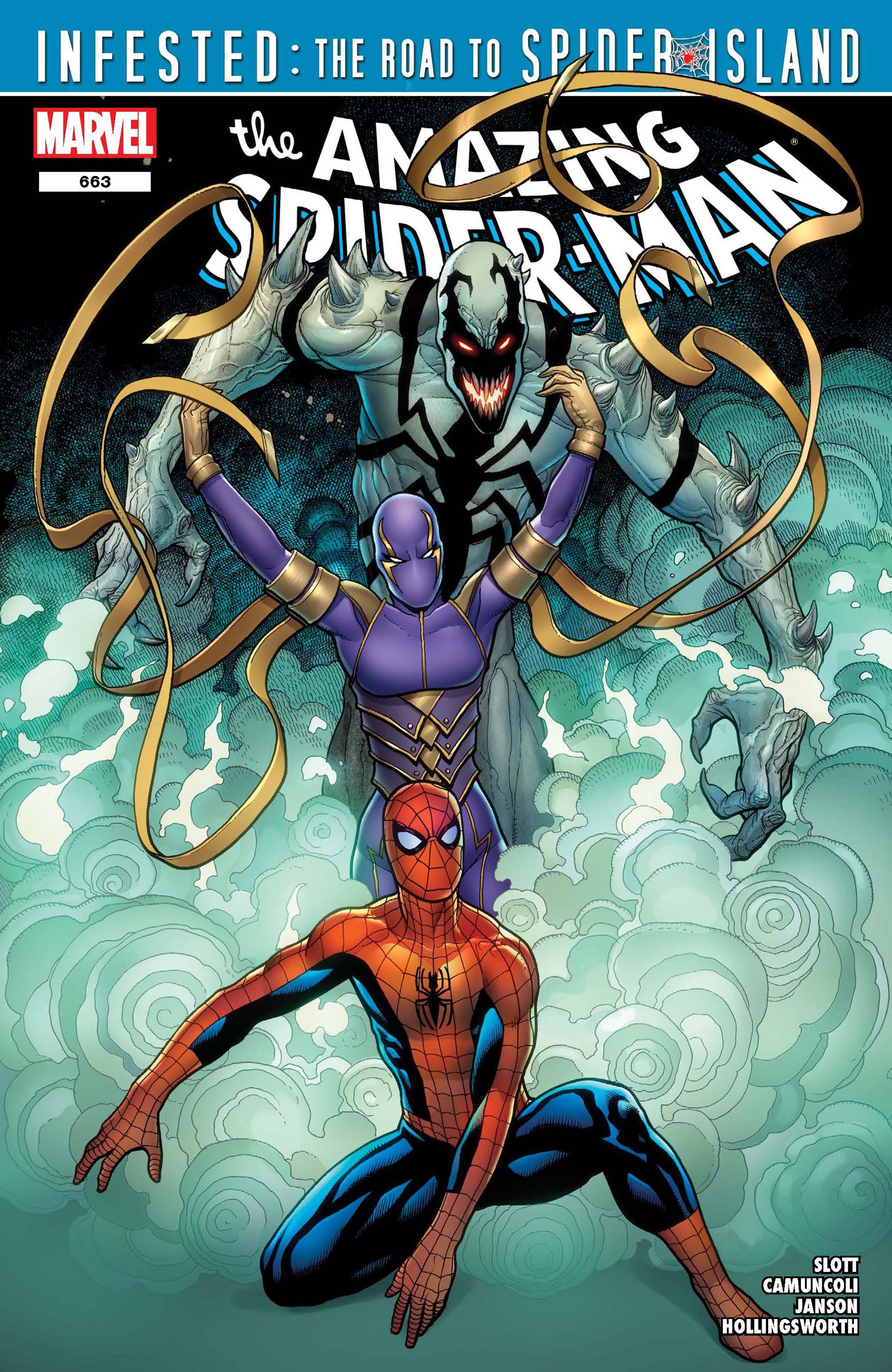
The published version showcases a very pretty blue/green hue within the smoke, and I wanted to switch shit up a bit and away from the usual palate that mainly consist of blues, reds, and blacks. I also took a little purple & gold from Wraith’s snazzy costume and added a bit of their properties into the matte choices. As for the frame, it’s radiates a bit of a brushed sea green look which I feel makes this beauty pop. Also, Frank for whatever reason decided to stray from the standard size of 11x17 and instead, craft this masterpiece on a larger board by several inches on each side, making this piece…a true centerpiece. Therefore, it’s the first piece you notice when coming in through the yard.
Here’s a few shots as they hang in the hallway. It’s a tight space, so it’s hard to truly convey in a photo, how fantastic it looks to be surrounded by all of these stunning pieces.
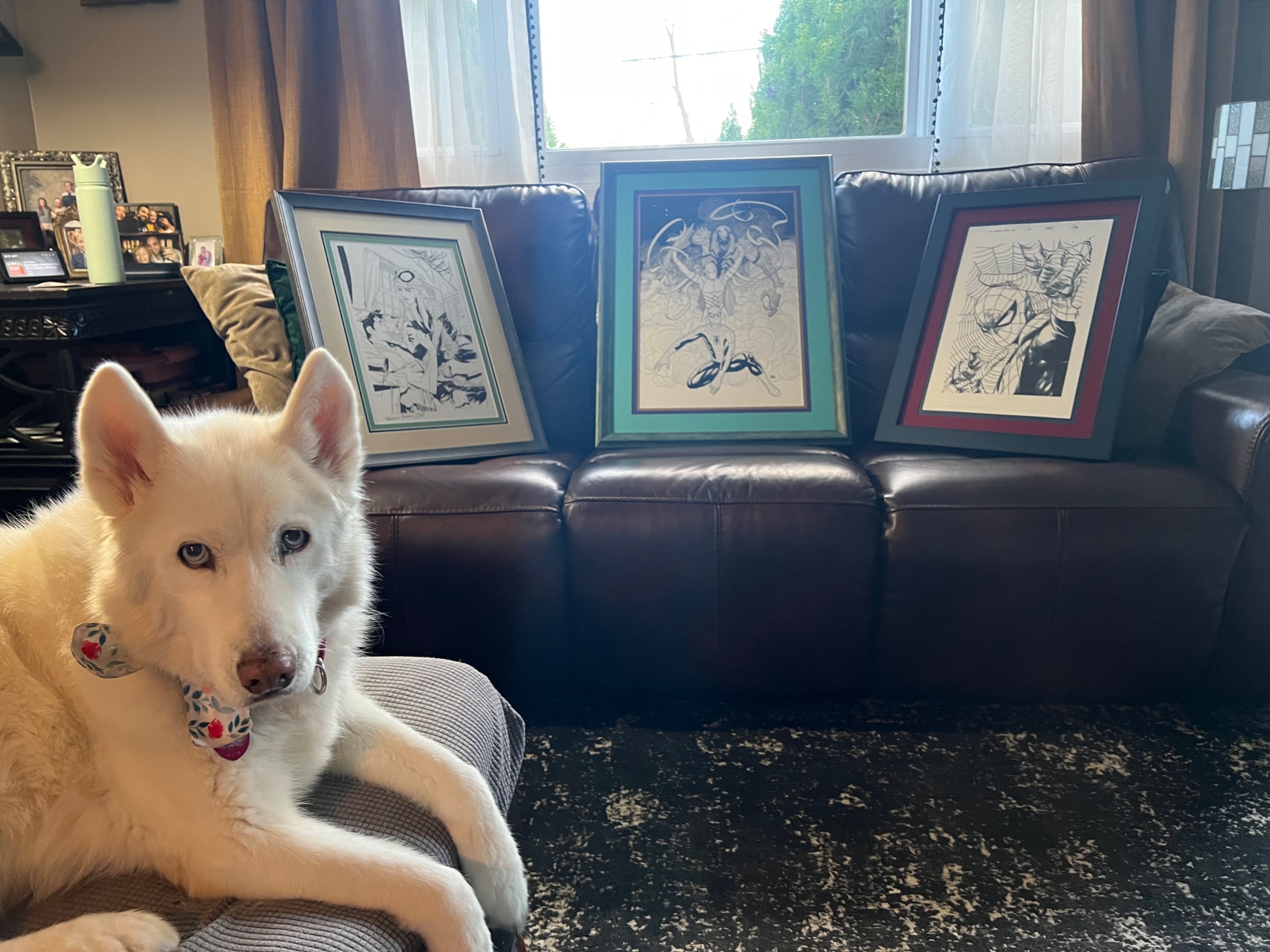
Maya just wanted to say “hi” here.
I really appreciate you all for sticking through this and sharing this fun moment with me. Also, big props to my super handy wife as without her, there would be a world of unnecessary nail holes in the walls alongside uneven spacing everywhere. You are a true gem & I love ya my dear. ❤️
Cheers homies,
Blewitt